# visualizeR  [](https://github.com/gnoblet/visualizeR/actions/workflows/R-CMD-check.yml)
[](https://app.codecov.io/gh/gnoblet/visualizeR?branch=main)
> What a color! What a viz!
`visualizeR` proposes some utils to sane colors, ready-to-go color
palettes, and a few visualization functions. The package is thoroughly
tested with comprehensive code coverage.
## Installation
You can install the last version of visualizeR from
[GitHub](https://github.com/) with:
``` r
# install.packages("devtools")
devtools::install_github("gnoblet/visualizeR", build_vignettes = TRUE)
```
## Roadmap
Roadmap is as follows:
- [ ] Full revamp of core functions (colors, pattern, incl. adding test
and pre-commit structures)
- [x] Add test coverage reporting via codecov
- [ ] Maintain \>80% test coverage across all functions
- [ ] Add other types of plots:
- [ ] Dumbell
- [ ] Waffle
- [ ] Donut
- [ ] Alluvial
- [ ] Option for tag with css code + for titles/subtitles/captions
## Request
Please, do not hesitate to pull request any new viz or colors or color
palettes, or to email request any change ().
## Code Coverage
`visualizeR` uses [codecov](https://codecov.io/) for test coverage
reporting. You can see the current coverage status by clicking on the
codecov badge at the top of this README. We aim to maintain high test
coverage to ensure code reliability and stability.
## Colors
Functions to access colors and palettes are `color()` or `palette()`.
Feel free to pull request new colors.
``` r
library(visualizeR)
# Get all saved colors, named
color(unname = F)[1:10]
#> white lighter_grey light_grey dark_grey light_blue_grey
#> "#FFFFFF" "#F5F5F5" "#E3E3E3" "#464647" "#B3C6D1"
#> grey black cat_2_yellow_1 cat_2_yellow_2 cat_2_light_1
#> "#71716F" "#000000" "#ffc20a" "#0c7bdc" "#fefe62"
# Extract a color palette as hexadecimal codes and reversed
palette(palette = "cat_5_main", reversed = TRUE, color_ramp_palette = FALSE)
#> [1] "#083d77" "#4ecdc4" "#f4c095" "#b47eb3" "#ffd5ff"
# Get all color palettes names
palette(show_palettes = TRUE)
#> [1] "cat_2_yellow" "cat_2_light"
#> [3] "cat_2_green" "cat_2_blue"
#> [5] "cat_5_main" "cat_5_ibm"
#> [7] "cat_3_aquamarine" "cat_3_tol_high_contrast"
#> [9] "cat_8_tol_adapted" "cat_3_custom_1"
#> [11] "cat_4_custom_1" "cat_5_custom_1"
#> [13] "cat_6_custom_1" "div_5_orange_blue"
#> [15] "div_5_green_purple"
```
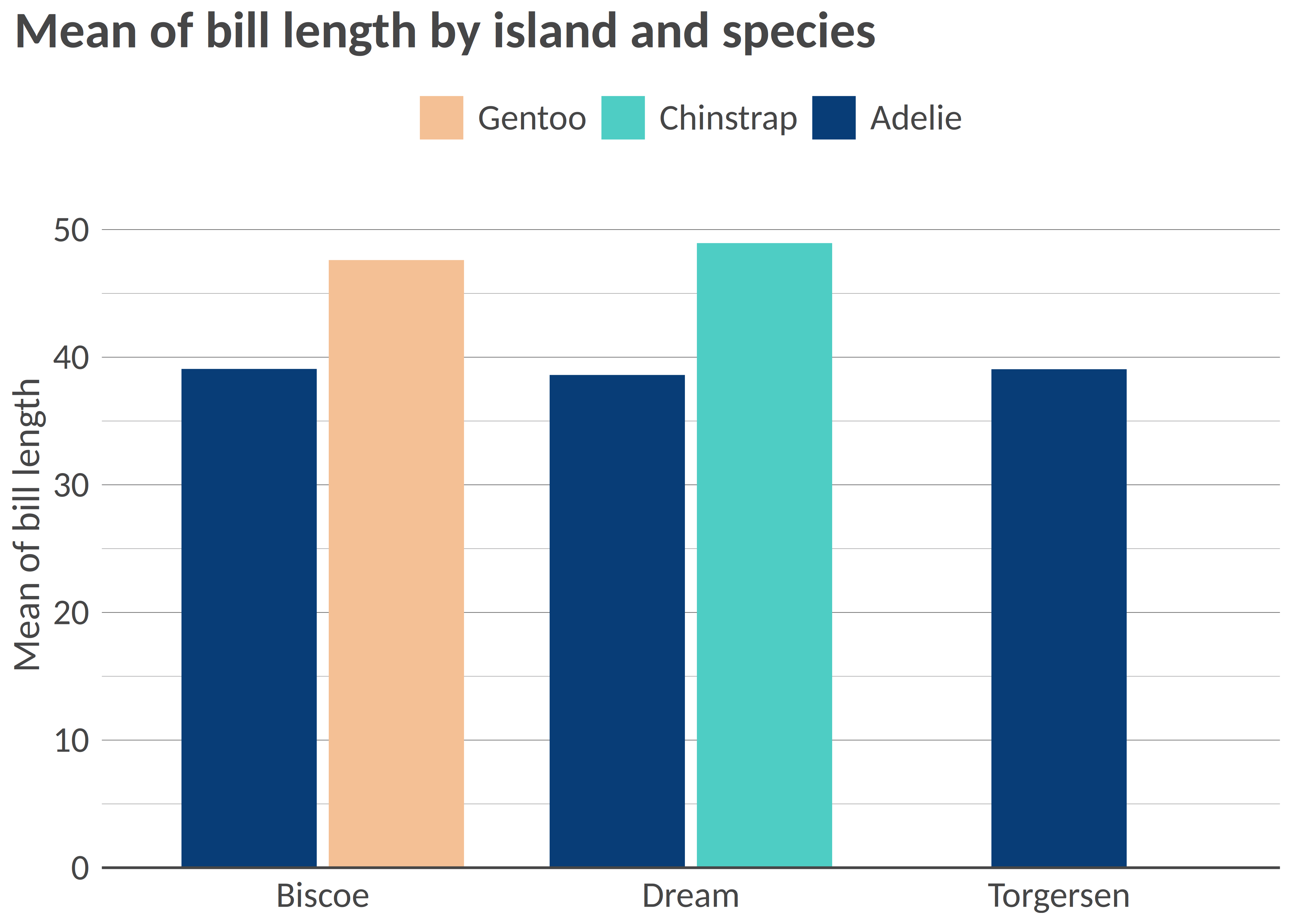
## Charts
### Example 1: Bar chart
``` r
library(palmerpenguins)
library(dplyr)
df <- penguins |>
group_by(island, species) |>
summarize(
mean_bl = mean(bill_length_mm, na.rm = T),
mean_fl = mean(flipper_length_mm, na.rm = T)
) |>
ungroup()
df_island <- penguins |>
group_by(island) |>
summarize(
mean_bl = mean(bill_length_mm, na.rm = T),
mean_fl = mean(flipper_length_mm, na.rm = T)
) |>
ungroup()
# Simple bar chart by group with some alpha transparency
bar(df, "island", "mean_bl", "species", x_title = "Mean of bill length", title = "Mean of bill length by island and species")
```
[](https://github.com/gnoblet/visualizeR/actions/workflows/R-CMD-check.yml)
[](https://app.codecov.io/gh/gnoblet/visualizeR?branch=main)
> What a color! What a viz!
`visualizeR` proposes some utils to sane colors, ready-to-go color
palettes, and a few visualization functions. The package is thoroughly
tested with comprehensive code coverage.
## Installation
You can install the last version of visualizeR from
[GitHub](https://github.com/) with:
``` r
# install.packages("devtools")
devtools::install_github("gnoblet/visualizeR", build_vignettes = TRUE)
```
## Roadmap
Roadmap is as follows:
- [ ] Full revamp of core functions (colors, pattern, incl. adding test
and pre-commit structures)
- [x] Add test coverage reporting via codecov
- [ ] Maintain \>80% test coverage across all functions
- [ ] Add other types of plots:
- [ ] Dumbell
- [ ] Waffle
- [ ] Donut
- [ ] Alluvial
- [ ] Option for tag with css code + for titles/subtitles/captions
## Request
Please, do not hesitate to pull request any new viz or colors or color
palettes, or to email request any change ().
## Code Coverage
`visualizeR` uses [codecov](https://codecov.io/) for test coverage
reporting. You can see the current coverage status by clicking on the
codecov badge at the top of this README. We aim to maintain high test
coverage to ensure code reliability and stability.
## Colors
Functions to access colors and palettes are `color()` or `palette()`.
Feel free to pull request new colors.
``` r
library(visualizeR)
# Get all saved colors, named
color(unname = F)[1:10]
#> white lighter_grey light_grey dark_grey light_blue_grey
#> "#FFFFFF" "#F5F5F5" "#E3E3E3" "#464647" "#B3C6D1"
#> grey black cat_2_yellow_1 cat_2_yellow_2 cat_2_light_1
#> "#71716F" "#000000" "#ffc20a" "#0c7bdc" "#fefe62"
# Extract a color palette as hexadecimal codes and reversed
palette(palette = "cat_5_main", reversed = TRUE, color_ramp_palette = FALSE)
#> [1] "#083d77" "#4ecdc4" "#f4c095" "#b47eb3" "#ffd5ff"
# Get all color palettes names
palette(show_palettes = TRUE)
#> [1] "cat_2_yellow" "cat_2_light"
#> [3] "cat_2_green" "cat_2_blue"
#> [5] "cat_5_main" "cat_5_ibm"
#> [7] "cat_3_aquamarine" "cat_3_tol_high_contrast"
#> [9] "cat_8_tol_adapted" "cat_3_custom_1"
#> [11] "cat_4_custom_1" "cat_5_custom_1"
#> [13] "cat_6_custom_1" "div_5_orange_blue"
#> [15] "div_5_green_purple"
```
## Charts
### Example 1: Bar chart
``` r
library(palmerpenguins)
library(dplyr)
df <- penguins |>
group_by(island, species) |>
summarize(
mean_bl = mean(bill_length_mm, na.rm = T),
mean_fl = mean(flipper_length_mm, na.rm = T)
) |>
ungroup()
df_island <- penguins |>
group_by(island) |>
summarize(
mean_bl = mean(bill_length_mm, na.rm = T),
mean_fl = mean(flipper_length_mm, na.rm = T)
) |>
ungroup()
# Simple bar chart by group with some alpha transparency
bar(df, "island", "mean_bl", "species", x_title = "Mean of bill length", title = "Mean of bill length by island and species")
```
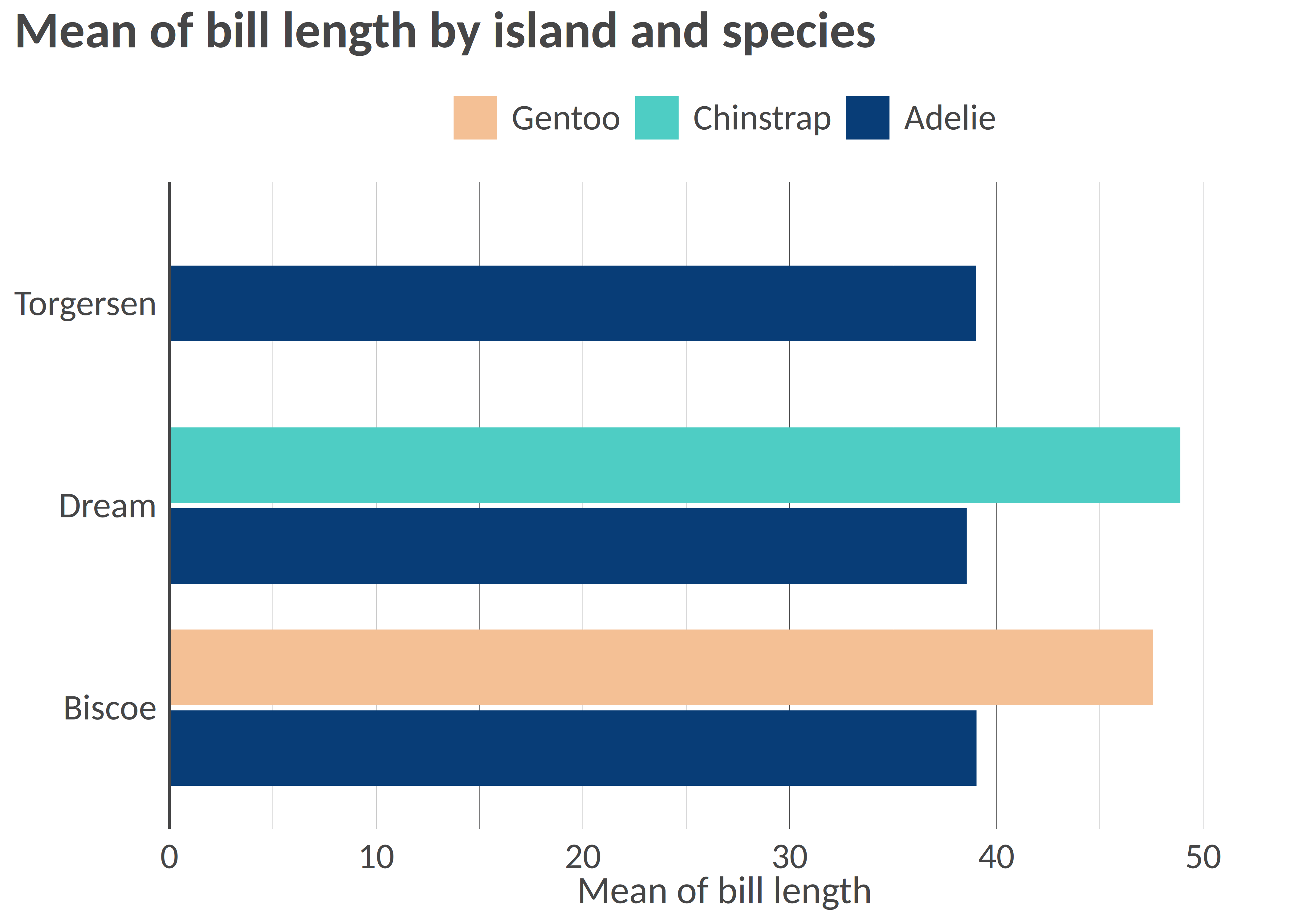
 ``` r
# Flipped / Horizontal
hbar(df, "island", "mean_bl", "species", x_title = "Mean of bill length", title = "Mean of bill length by island and species")
```
``` r
# Flipped / Horizontal
hbar(df, "island", "mean_bl", "species", x_title = "Mean of bill length", title = "Mean of bill length by island and species")
```
 ``` r
# Facetted
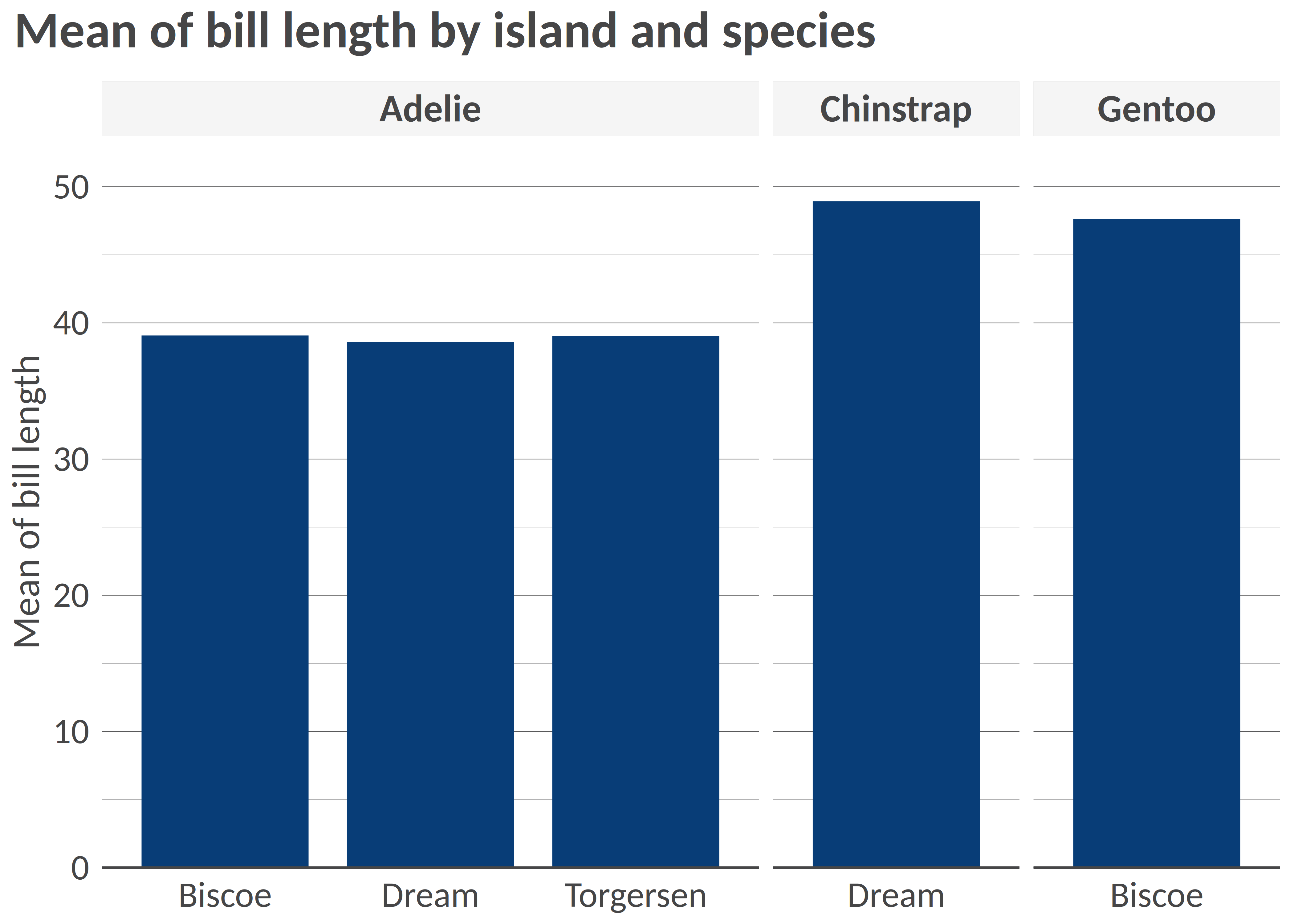
bar(df, "island", "mean_bl", facet = "species", x_title = "Mean of bill length", title = "Mean of bill length by island and species", add_color_guide = FALSE)
```
``` r
# Facetted
bar(df, "island", "mean_bl", facet = "species", x_title = "Mean of bill length", title = "Mean of bill length by island and species", add_color_guide = FALSE)
```
 ``` r
# Flipped, with text, smaller width, and caption
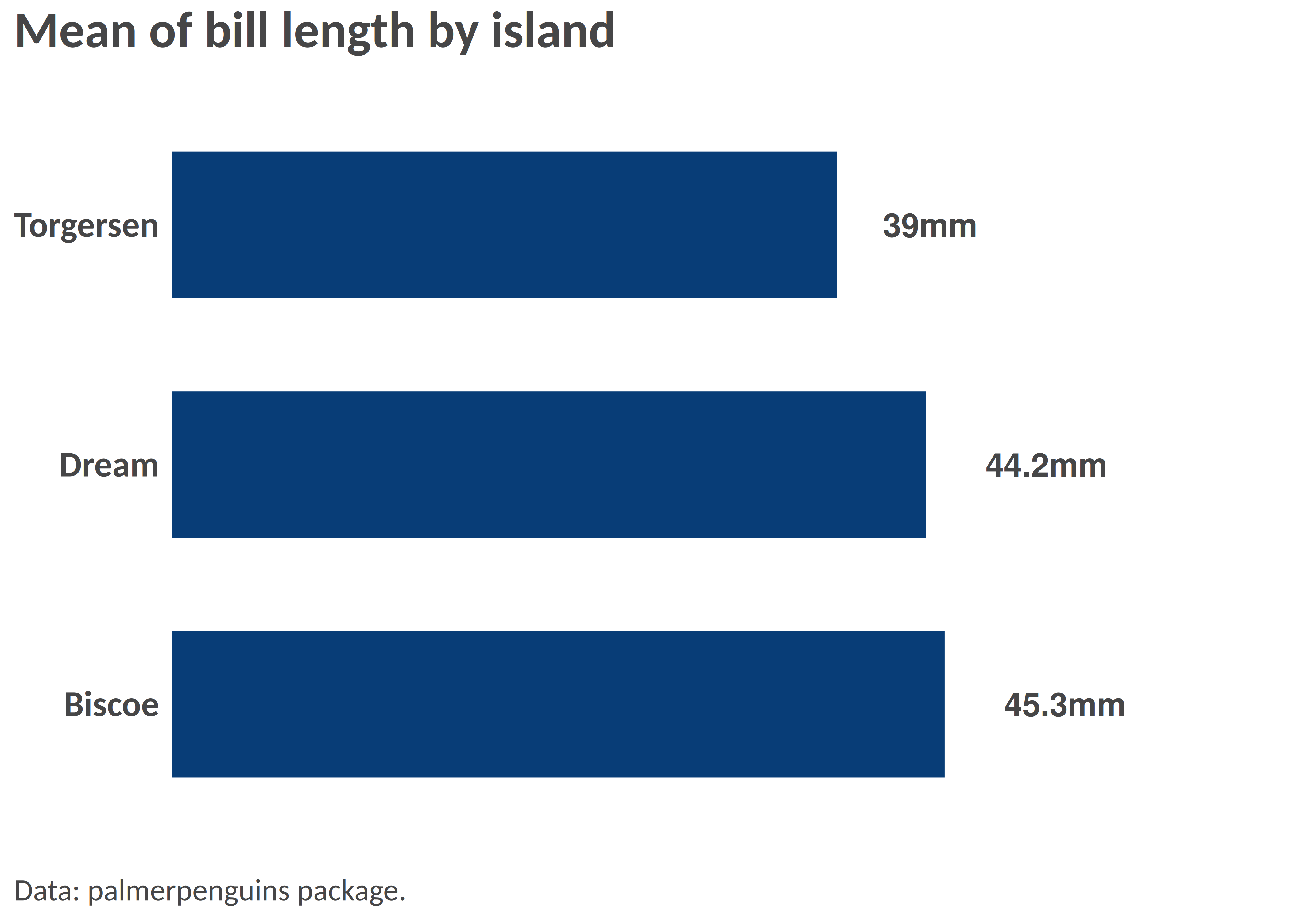
hbar(df = df_island, x = "island", y = "mean_bl", title = "Mean of bill length by island", add_text = T, width = 0.6, add_text_suffix = "mm", add_text_expand_limit = 1.3, add_color_guide = FALSE, caption = "Data: palmerpenguins package.")
```
``` r
# Flipped, with text, smaller width, and caption
hbar(df = df_island, x = "island", y = "mean_bl", title = "Mean of bill length by island", add_text = T, width = 0.6, add_text_suffix = "mm", add_text_expand_limit = 1.3, add_color_guide = FALSE, caption = "Data: palmerpenguins package.")
```
 ### Example 2: Scatterplot
``` r
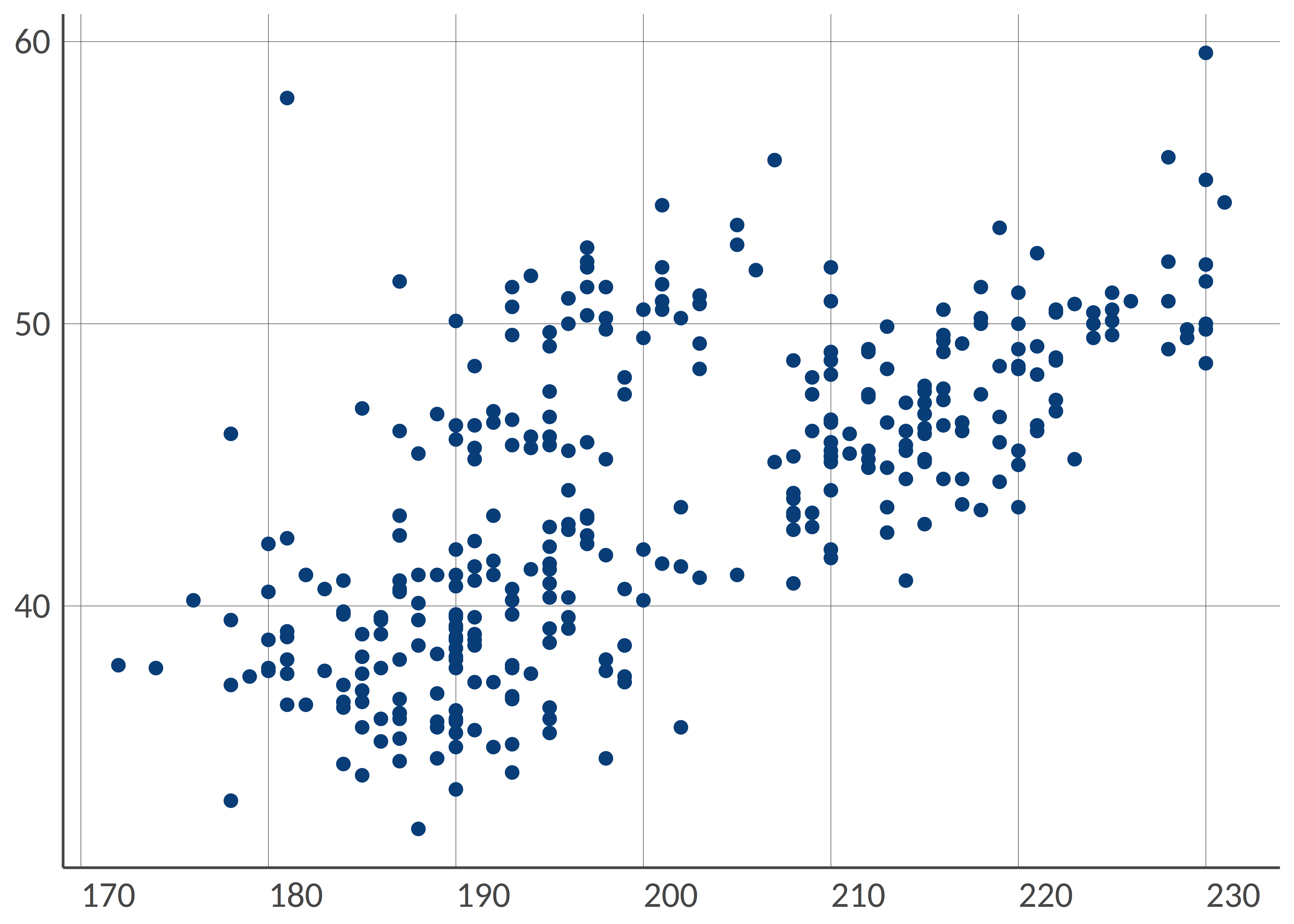
# Simple scatterplot
point(penguins, "bill_length_mm", "flipper_length_mm")
```
### Example 2: Scatterplot
``` r
# Simple scatterplot
point(penguins, "bill_length_mm", "flipper_length_mm")
```
 ``` r
# Scatterplot with grouping colors, greater dot size, some transparency
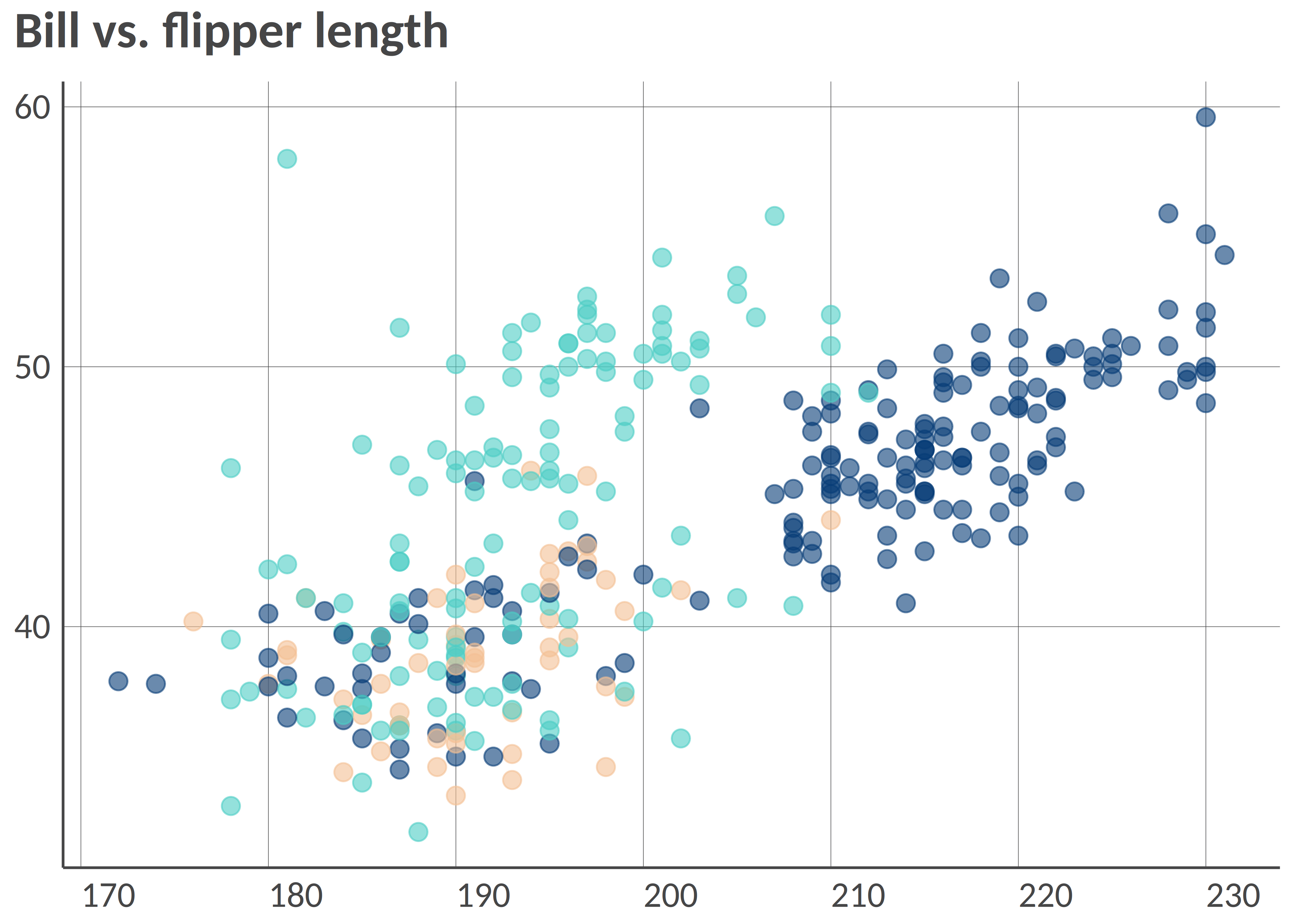
point(penguins, "bill_length_mm", "flipper_length_mm", "island", group_title = "Island", alpha = 0.6, size = 3, title = "Bill vs. flipper length", , add_color_guide = FALSE)
```
``` r
# Scatterplot with grouping colors, greater dot size, some transparency
point(penguins, "bill_length_mm", "flipper_length_mm", "island", group_title = "Island", alpha = 0.6, size = 3, title = "Bill vs. flipper length", , add_color_guide = FALSE)
```
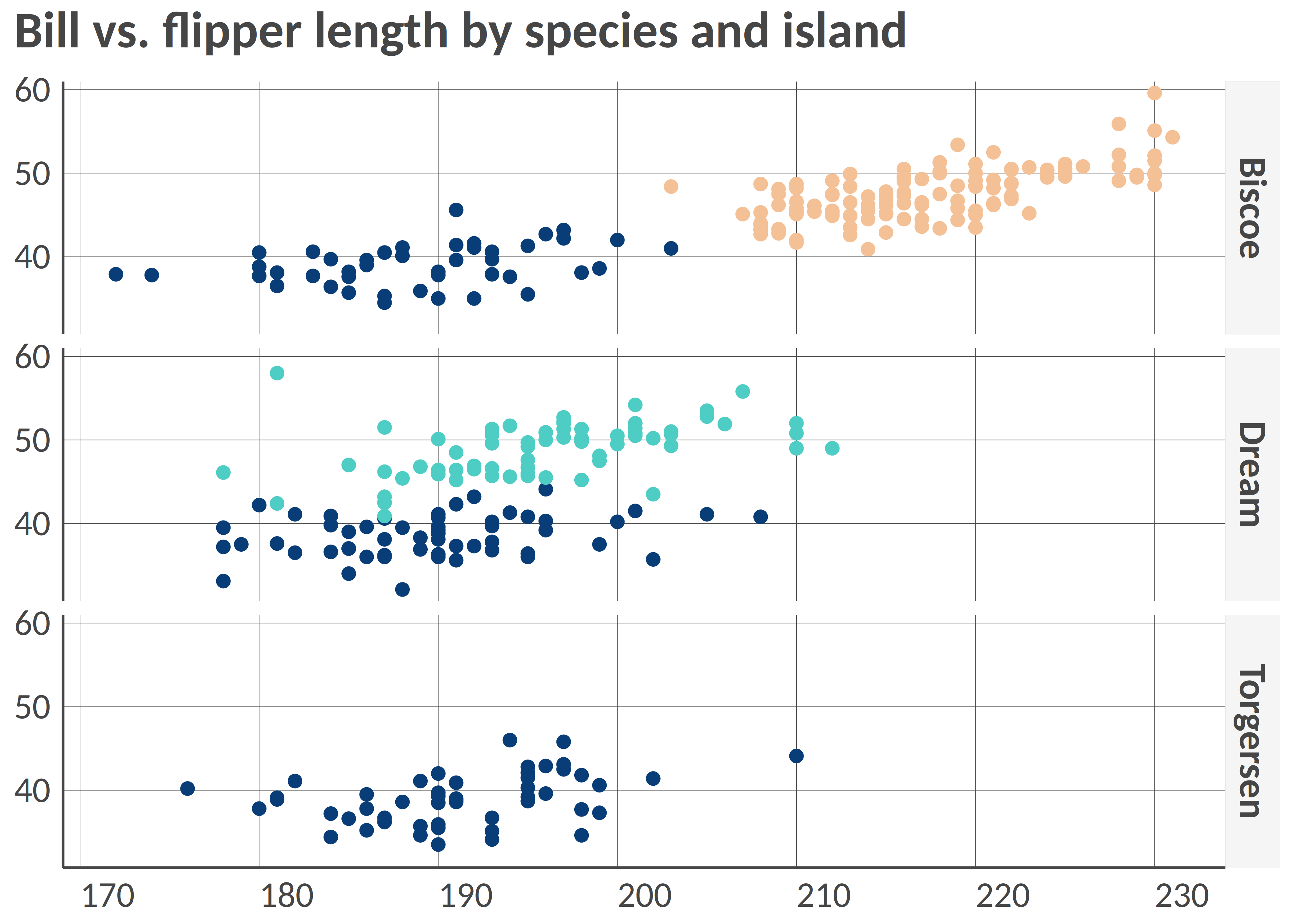
 ``` r
# Facetted scatterplot by island
point(penguins, "bill_length_mm", "flipper_length_mm", "species", "island", "fixed", group_title = "Species", title = "Bill vs. flipper length by species and island", add_color_guide = FALSE)
```
``` r
# Facetted scatterplot by island
point(penguins, "bill_length_mm", "flipper_length_mm", "species", "island", "fixed", group_title = "Species", title = "Bill vs. flipper length by species and island", add_color_guide = FALSE)
```
 ### Example 3: Dumbbell plot
Remember to ensure that your data are in the long format and you only
have two groups on the x-axis; for instance, IDP and returnee and no NA
values.
``` r
# Prepare long data
df <- tibble::tibble(
admin1 = rep(letters[1:8], 2),
setting = c(rep(c("Rural", "Urban"), 4), rep(c("Urban", "Rural"), 4)),
stat = rnorm(16, mean = 50, sd = 18)
) |>
dplyr::mutate(stat = round(stat, 0))
# dumbbell(
# df,
# 'stat',
# 'setting',
# 'admin1',
# title = '% of HHs that reported open defecation as sanitation facility',
# group_y_title = 'Admin 1',
# group_x_title = 'Setting'
# )
```
### Example 4: donut chart
``` r
# Some summarized data: % of HHs by displacement status
df <- tibble::tibble(
status = c("Displaced", "Non displaced", "Returnee", "Don't know/Prefer not to say"),
percentage = c(18, 65, 12, 3)
)
# Donut
# donut(df,
# status,
# percentage,
# hole_size = 3,
# add_text_suffix = '%',
# add_text_color = color('dark_grey'),
# add_text_treshold_display = 5,
# x_title = 'Displacement status',
# title = '% of HHs by displacement status'
# )
```
### Example 5: Waffle chart
``` r
#
# waffle(df, status, percentage, x_title = 'A caption', title = 'A title', subtitle = 'A subtitle')
```
### Example 6: Alluvial chart
``` r
# Some summarized data: % of HHs by self-reported status of displacement in 2021 and in 2022
df <- tibble::tibble(
status_from = c(
rep("Displaced", 4),
rep("Non displaced", 4),
rep("Returnee", 4),
rep("Dnk/Pnts", 4)
),
status_to = c("Displaced", "Non displaced", "Returnee", "Dnk/Pnts", "Displaced", "Non displaced", "Returnee", "Dnk/Pnts", "Displaced", "Non displaced", "Returnee", "Dnk/Pnts", "Displaced", "Non displaced", "Returnee", "Dnk/Pnts"),
percentage = c(20, 8, 18, 1, 12, 21, 0, 2, 0, 3, 12, 1, 0, 0, 1, 1)
)
# Alluvial, here the group is the status for 2021
# alluvial(df,
# status_from,
# status_to,
# percentage,
# status_from,
# from_levels = c("Displaced", "Non displaced", "Returnee", "Dnk/Pnts"),
# alpha = 0.8,
# group_title = "Status for 2021",
# title = "% of HHs by self-reported status from 2021 to 2022"
# )
```
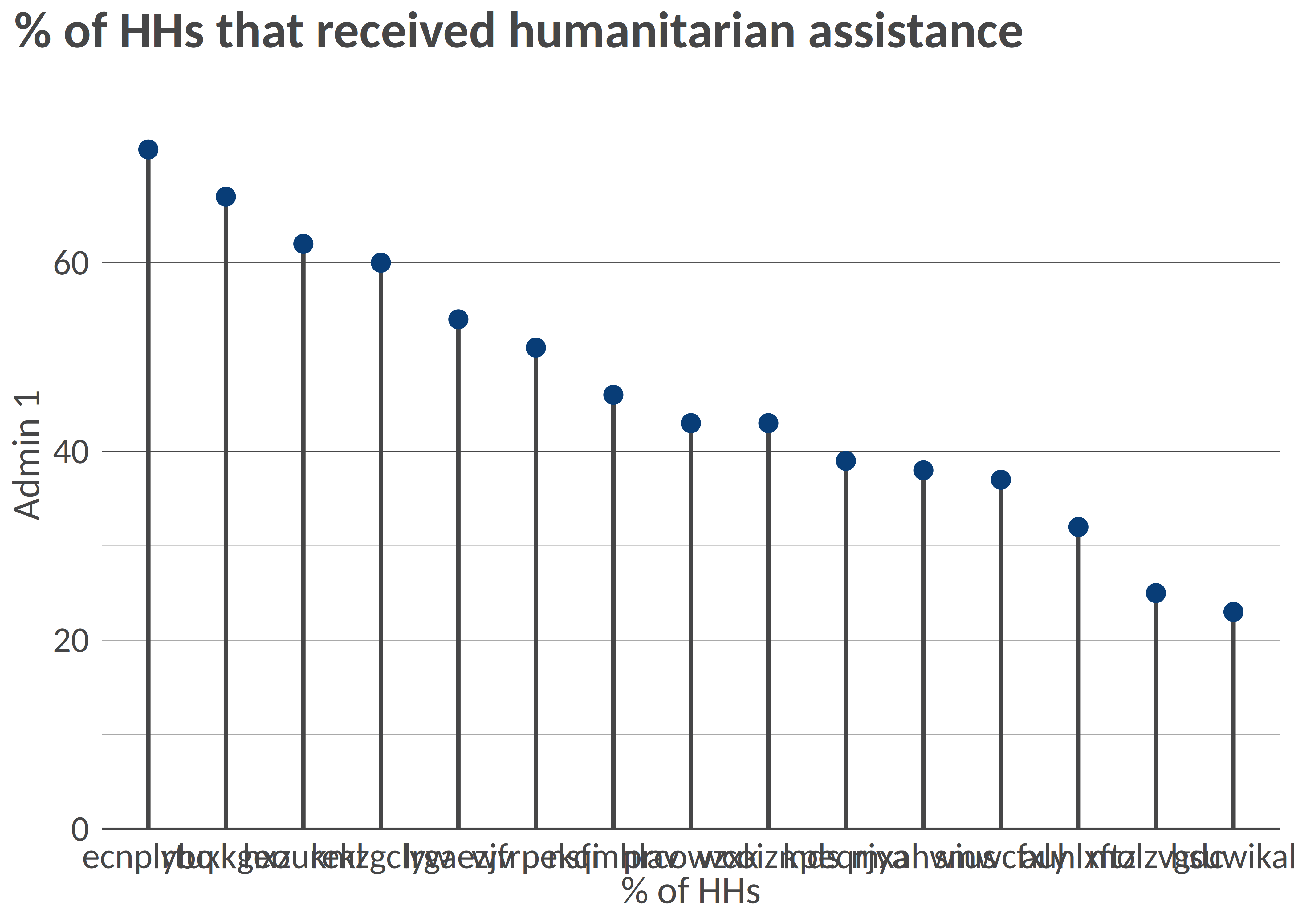
### Example 7: Lollipop chart
``` r
library(tidyr)
# Prepare long data
df <- tibble::tibble(
admin1 = replicate(15, sample(letters, 8)) |> t() |> as.data.frame() |> unite("admin1", sep = "") |> dplyr::pull(admin1),
stat = rnorm(15, mean = 50, sd = 15)
) |>
dplyr::mutate(stat = round(stat, 0))
# Simple vertical lollipop chart
lollipop(
df = df,
x = "admin1",
y = "stat",
flip = FALSE,
dot_size = 3,
y_title = "% of HHs",
x_title = "Admin 1",
title = "% of HHs that received humanitarian assistance"
)
```
### Example 3: Dumbbell plot
Remember to ensure that your data are in the long format and you only
have two groups on the x-axis; for instance, IDP and returnee and no NA
values.
``` r
# Prepare long data
df <- tibble::tibble(
admin1 = rep(letters[1:8], 2),
setting = c(rep(c("Rural", "Urban"), 4), rep(c("Urban", "Rural"), 4)),
stat = rnorm(16, mean = 50, sd = 18)
) |>
dplyr::mutate(stat = round(stat, 0))
# dumbbell(
# df,
# 'stat',
# 'setting',
# 'admin1',
# title = '% of HHs that reported open defecation as sanitation facility',
# group_y_title = 'Admin 1',
# group_x_title = 'Setting'
# )
```
### Example 4: donut chart
``` r
# Some summarized data: % of HHs by displacement status
df <- tibble::tibble(
status = c("Displaced", "Non displaced", "Returnee", "Don't know/Prefer not to say"),
percentage = c(18, 65, 12, 3)
)
# Donut
# donut(df,
# status,
# percentage,
# hole_size = 3,
# add_text_suffix = '%',
# add_text_color = color('dark_grey'),
# add_text_treshold_display = 5,
# x_title = 'Displacement status',
# title = '% of HHs by displacement status'
# )
```
### Example 5: Waffle chart
``` r
#
# waffle(df, status, percentage, x_title = 'A caption', title = 'A title', subtitle = 'A subtitle')
```
### Example 6: Alluvial chart
``` r
# Some summarized data: % of HHs by self-reported status of displacement in 2021 and in 2022
df <- tibble::tibble(
status_from = c(
rep("Displaced", 4),
rep("Non displaced", 4),
rep("Returnee", 4),
rep("Dnk/Pnts", 4)
),
status_to = c("Displaced", "Non displaced", "Returnee", "Dnk/Pnts", "Displaced", "Non displaced", "Returnee", "Dnk/Pnts", "Displaced", "Non displaced", "Returnee", "Dnk/Pnts", "Displaced", "Non displaced", "Returnee", "Dnk/Pnts"),
percentage = c(20, 8, 18, 1, 12, 21, 0, 2, 0, 3, 12, 1, 0, 0, 1, 1)
)
# Alluvial, here the group is the status for 2021
# alluvial(df,
# status_from,
# status_to,
# percentage,
# status_from,
# from_levels = c("Displaced", "Non displaced", "Returnee", "Dnk/Pnts"),
# alpha = 0.8,
# group_title = "Status for 2021",
# title = "% of HHs by self-reported status from 2021 to 2022"
# )
```
### Example 7: Lollipop chart
``` r
library(tidyr)
# Prepare long data
df <- tibble::tibble(
admin1 = replicate(15, sample(letters, 8)) |> t() |> as.data.frame() |> unite("admin1", sep = "") |> dplyr::pull(admin1),
stat = rnorm(15, mean = 50, sd = 15)
) |>
dplyr::mutate(stat = round(stat, 0))
# Simple vertical lollipop chart
lollipop(
df = df,
x = "admin1",
y = "stat",
flip = FALSE,
dot_size = 3,
y_title = "% of HHs",
x_title = "Admin 1",
title = "% of HHs that received humanitarian assistance"
)
```
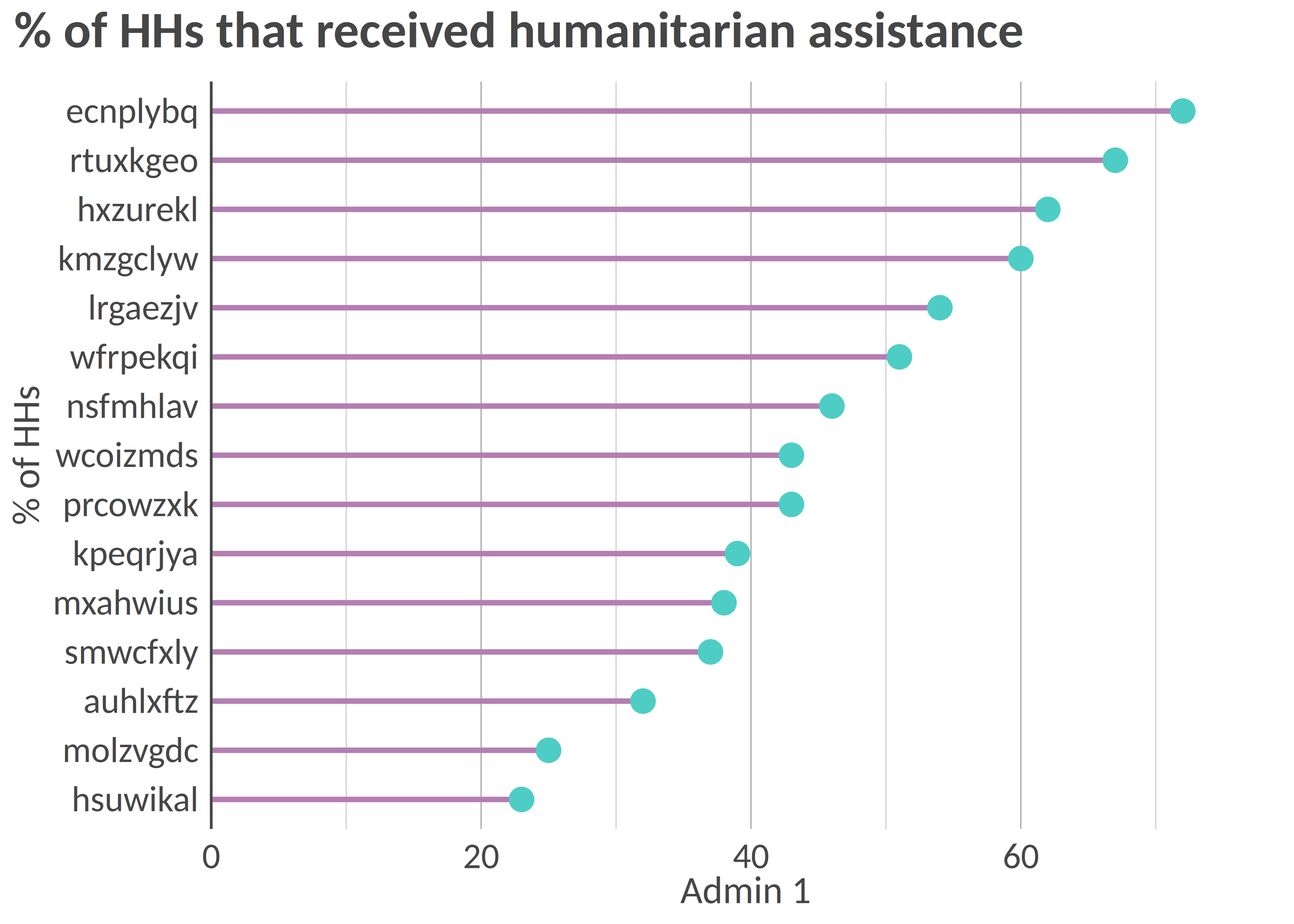
 ``` r
# Horizontal lollipop chart with custom colors
hlollipop(
df = df,
x = "admin1",
y = "stat",
dot_size = 4,
line_size = 1,
add_color = color("cat_5_main_2"),
line_color = color("cat_5_main_4"),
y_title = "% of HHs",
x_title = "Admin 1",
title = "% of HHs that received humanitarian assistance"
)
```
``` r
# Horizontal lollipop chart with custom colors
hlollipop(
df = df,
x = "admin1",
y = "stat",
dot_size = 4,
line_size = 1,
add_color = color("cat_5_main_2"),
line_color = color("cat_5_main_4"),
y_title = "% of HHs",
x_title = "Admin 1",
title = "% of HHs that received humanitarian assistance"
)
```
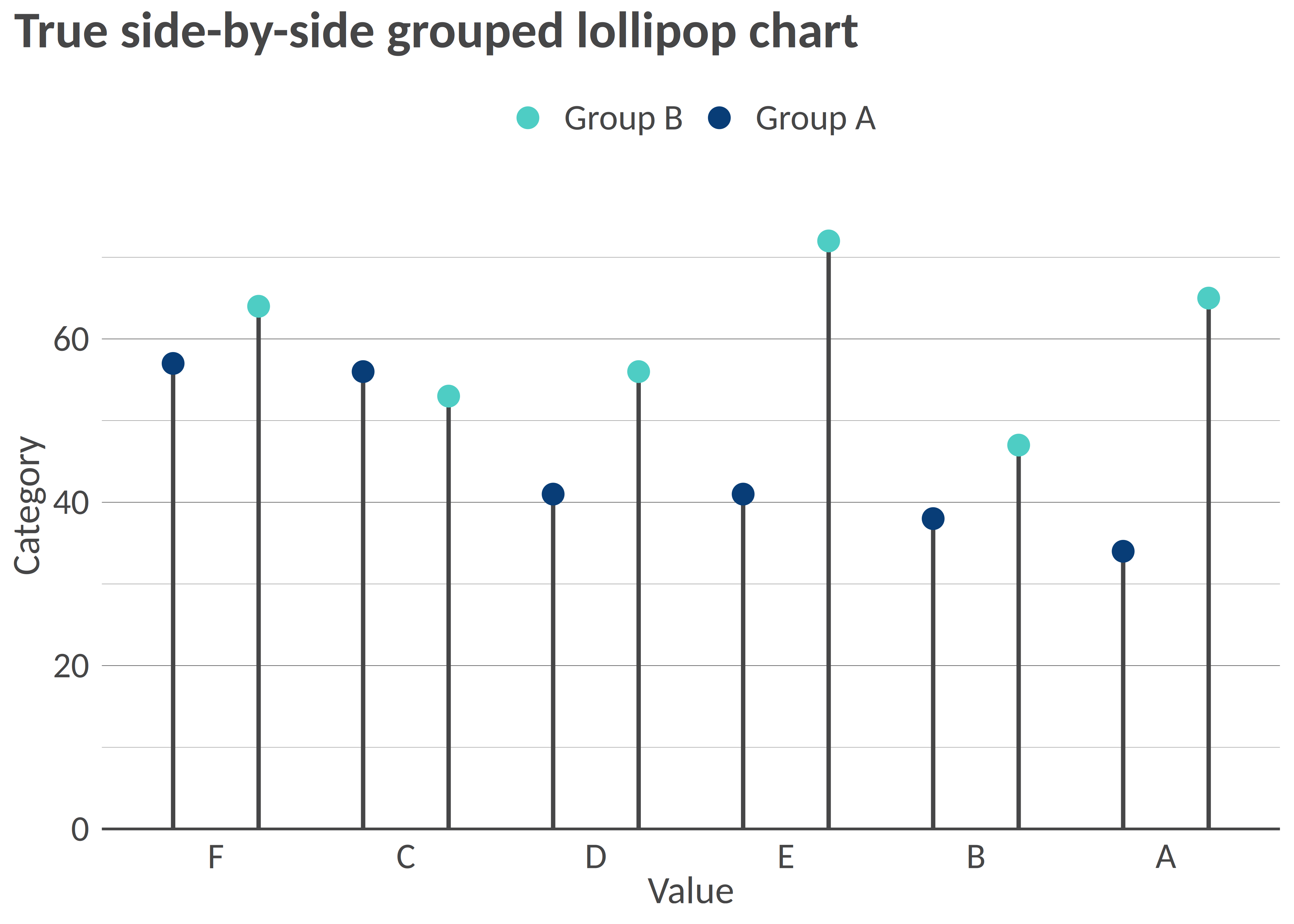
 ``` r
# Create data for grouped lollipop - using set.seed for reproducibility
set.seed(123)
df_grouped <- tibble::tibble(
admin1 = rep(c("A", "B", "C", "D", "E", "F"), 2),
group = rep(c("Group A", "Group B"), each = 6),
stat = c(rnorm(6, mean = 40, sd = 10), rnorm(6, mean = 60, sd = 10))
) |>
dplyr::mutate(stat = round(stat, 0))
# Grouped lollipop chart with proper side-by-side positioning
lollipop(
df = df_grouped,
x = "admin1",
y = "stat",
group = "group",
order = "grouped_y",
dot_size = 3.5,
line_size = 0.8,
y_title = "Value",
x_title = "Category",
title = "True side-by-side grouped lollipop chart"
)
```
``` r
# Create data for grouped lollipop - using set.seed for reproducibility
set.seed(123)
df_grouped <- tibble::tibble(
admin1 = rep(c("A", "B", "C", "D", "E", "F"), 2),
group = rep(c("Group A", "Group B"), each = 6),
stat = c(rnorm(6, mean = 40, sd = 10), rnorm(6, mean = 60, sd = 10))
) |>
dplyr::mutate(stat = round(stat, 0))
# Grouped lollipop chart with proper side-by-side positioning
lollipop(
df = df_grouped,
x = "admin1",
y = "stat",
group = "group",
order = "grouped_y",
dot_size = 3.5,
line_size = 0.8,
y_title = "Value",
x_title = "Category",
title = "True side-by-side grouped lollipop chart"
)
```
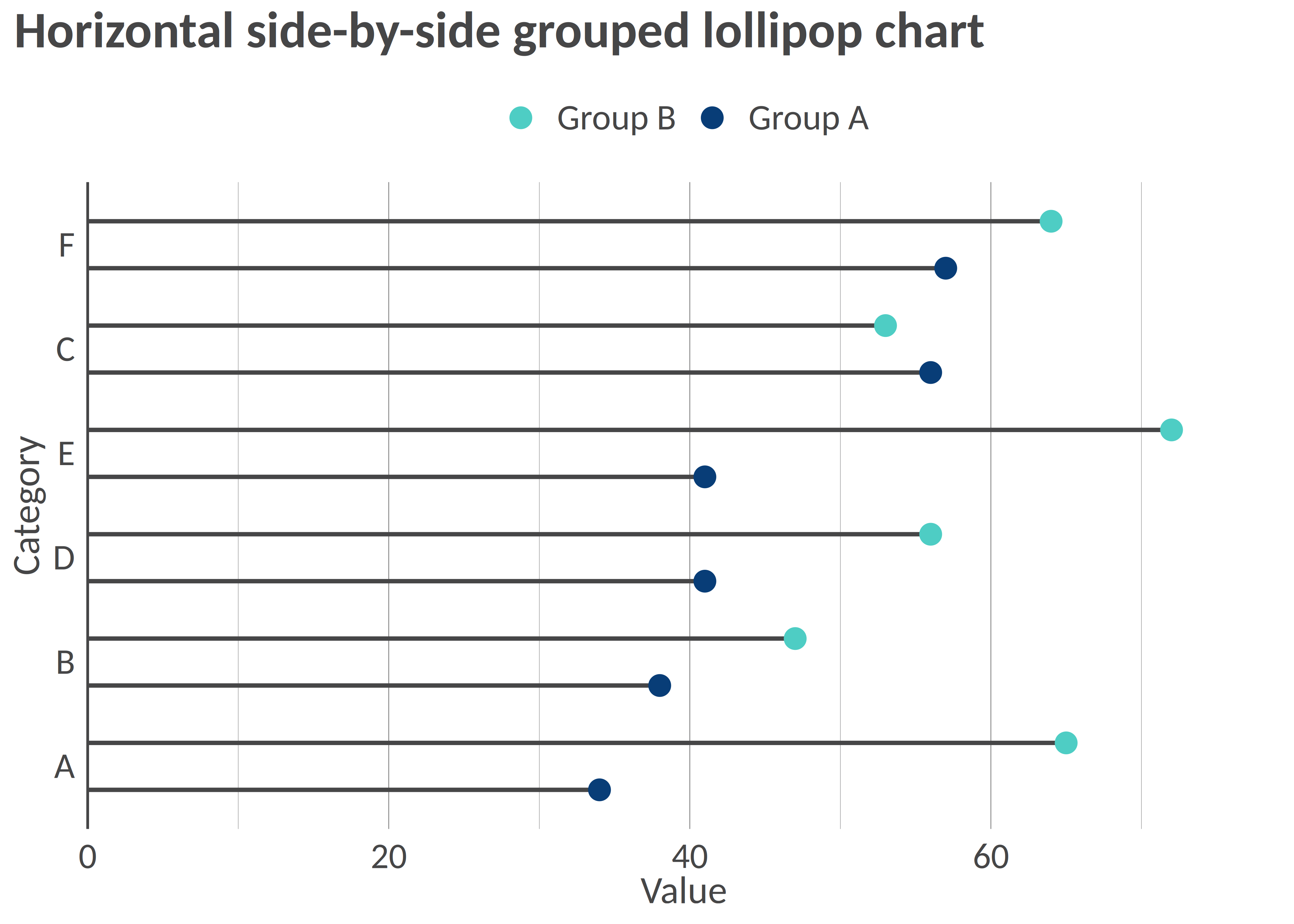
 ``` r
# Horizontal grouped lollipop chart
hlollipop(
df = df_grouped,
x = "admin1",
y = "stat",
group = "group",
dot_size = 3.5,
line_size = 0.8,
y_title = "Category",
x_title = "Value",
title = "Horizontal side-by-side grouped lollipop chart"
)
```
``` r
# Horizontal grouped lollipop chart
hlollipop(
df = df_grouped,
x = "admin1",
y = "stat",
group = "group",
dot_size = 3.5,
line_size = 0.8,
y_title = "Category",
x_title = "Value",
title = "Horizontal side-by-side grouped lollipop chart"
)
```