|
|
||
|---|---|---|
| docs | ||
| inst | ||
| man | ||
| pkgdown/favicon | ||
| R | ||
| renv | ||
| tests | ||
| vignettes | ||
| .gitignore | ||
| .pre-commit-config.yaml | ||
| .Rbuildignore | ||
| .Rprofile | ||
| _pkgdown.yml | ||
| DESCRIPTION | ||
| LICENSE.md | ||
| NAMESPACE | ||
| NEWS.md | ||
| pkgdown.css | ||
| README.md | ||
| README.Rmd | ||
| renv.lock | ||
| test-example.R | ||
| test.R | ||
| visualizeR.Rproj | ||
visualizeR 
What a color! What a viz!
visualizeR proposes some utils to sane colors, ready-to-go color
palettes, and a few visualization functions.
Installation
You can install the last version of visualizeR from GitHub with:
# install.packages("devtools")
devtools::install_github('gnoblet/visualizeR', build_vignettes = TRUE)
Roadmap
Roadmap is as follows:
- Full revamp of core functions (colors, pattern, incl. adding test and pre-commit structures)
- Add other types of plots:
- Dumbell
- Waffle
- Donut
- Alluvial
Request
Please, do not hesitate to pull request any new viz or colors or color palettes, or to email request any change (gnoblet@zaclys.net).
Colors
Functions to access colors and palettes are color() or palette().
Feel free to pull request new colors.
library(visualizeR)

# Get all saved colors, named
color(unname = F)[1:10]
#>           white    lighter_grey      light_grey       dark_grey light_blue_grey
#>       "#FFFFFF"       "#F5F5F5"       "#E3E3E3"       "#464647"       "#B3C6D1"
#>            grey           black  cat_2_yellow_1  cat_2_yellow_2   cat_2_light_1
#>       "#71716F"       "#000000"       "#ffc20a"       "#0c7bdc"       "#fefe62"

# Extract a color palette as hexadecimal codes and reversed
palette(palette = 'cat_5_main', reversed = TRUE, color_ramp_palette = FALSE)
#> [1] "#083d77" "#4ecdc4" "#f4c095" "#b47eb3" "#ffd5ff"

# Get all color palettes names
palette(show_palettes = TRUE)
#>  [1] "cat_2_yellow"            "cat_2_light"
#>  [3] "cat_2_green"             "cat_2_blue"
#>  [5] "cat_5_main"              "cat_5_ibm"
#>  [7] "cat_3_aquamarine"        "cat_3_tol_high_contrast"
#>  [9] "cat_8_tol_adapted"       "cat_3_custom_1"
#> [11] "cat_4_custom_1"          "cat_5_custom_1"
#> [13] "cat_6_custom_1"          "div_5_orange_blue"
#> [15] "div_5_green_purple"
Charts
Example 1: Bar chart
library(palmerpenguins)
library(dplyr)
df <- penguins |>
group_by(island, species) |>
summarize(
mean_bl = mean(bill_length_mm, na.rm = T),
mean_fl = mean(flipper_length_mm, na.rm = T)
) |>
ungroup()
df_island <- penguins |>
group_by(island) |>
summarize(
mean_bl = mean(bill_length_mm, na.rm = T),
mean_fl = mean(flipper_length_mm, na.rm = T)
) |>
ungroup()
# Simple bar chart by group with some alpha transparency
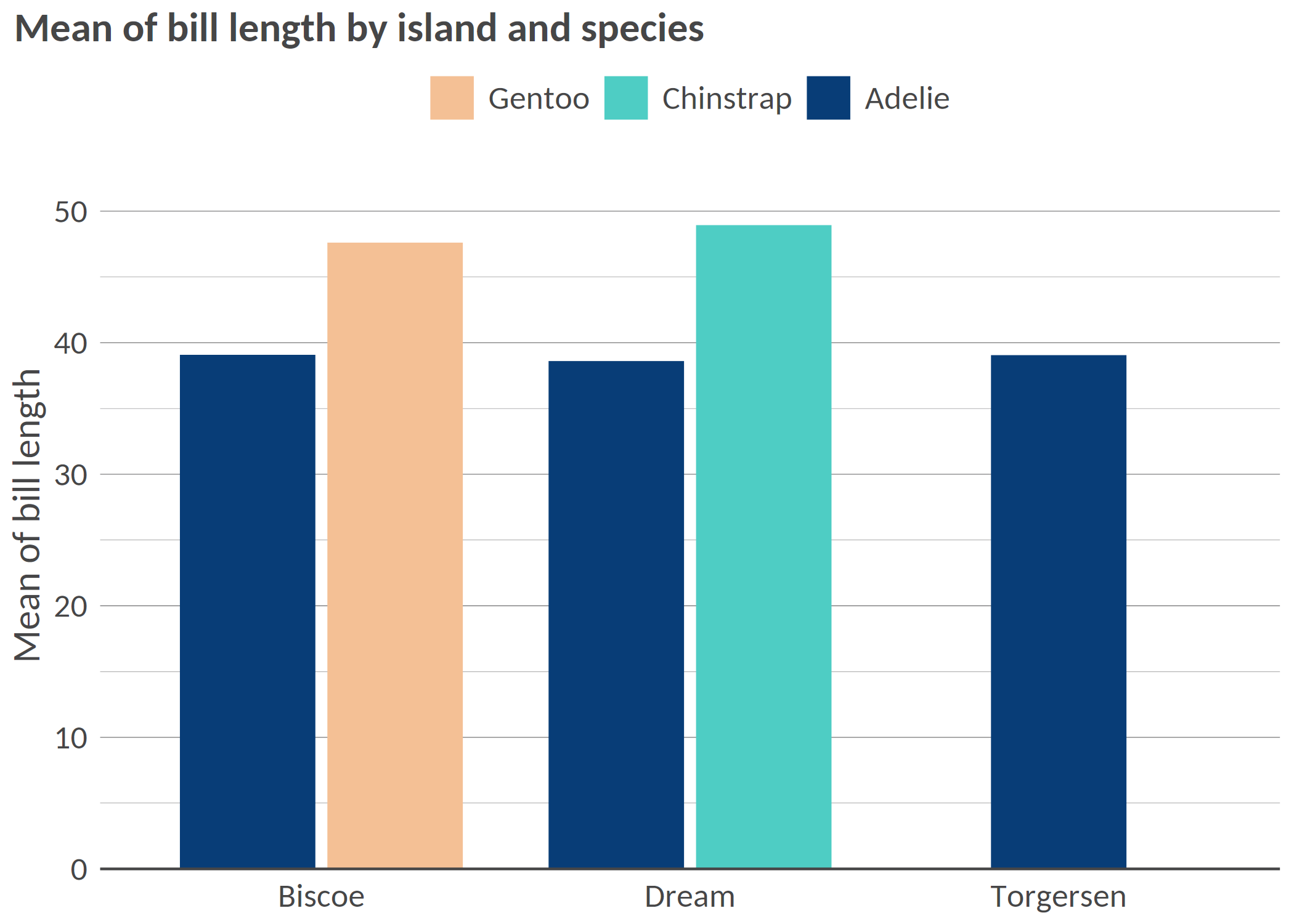
bar(df, 'island', 'mean_bl', 'species', x_title = 'Mean of bill length', title = 'Mean of bill length by island and species')
# Flipped / Horizontal
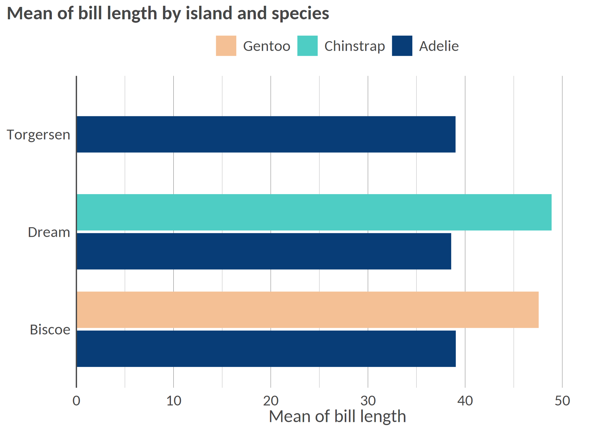
hbar(df, 'island', 'mean_bl', 'species', x_title = 'Mean of bill length', title = 'Mean of bill length by island and species')
# Facetted
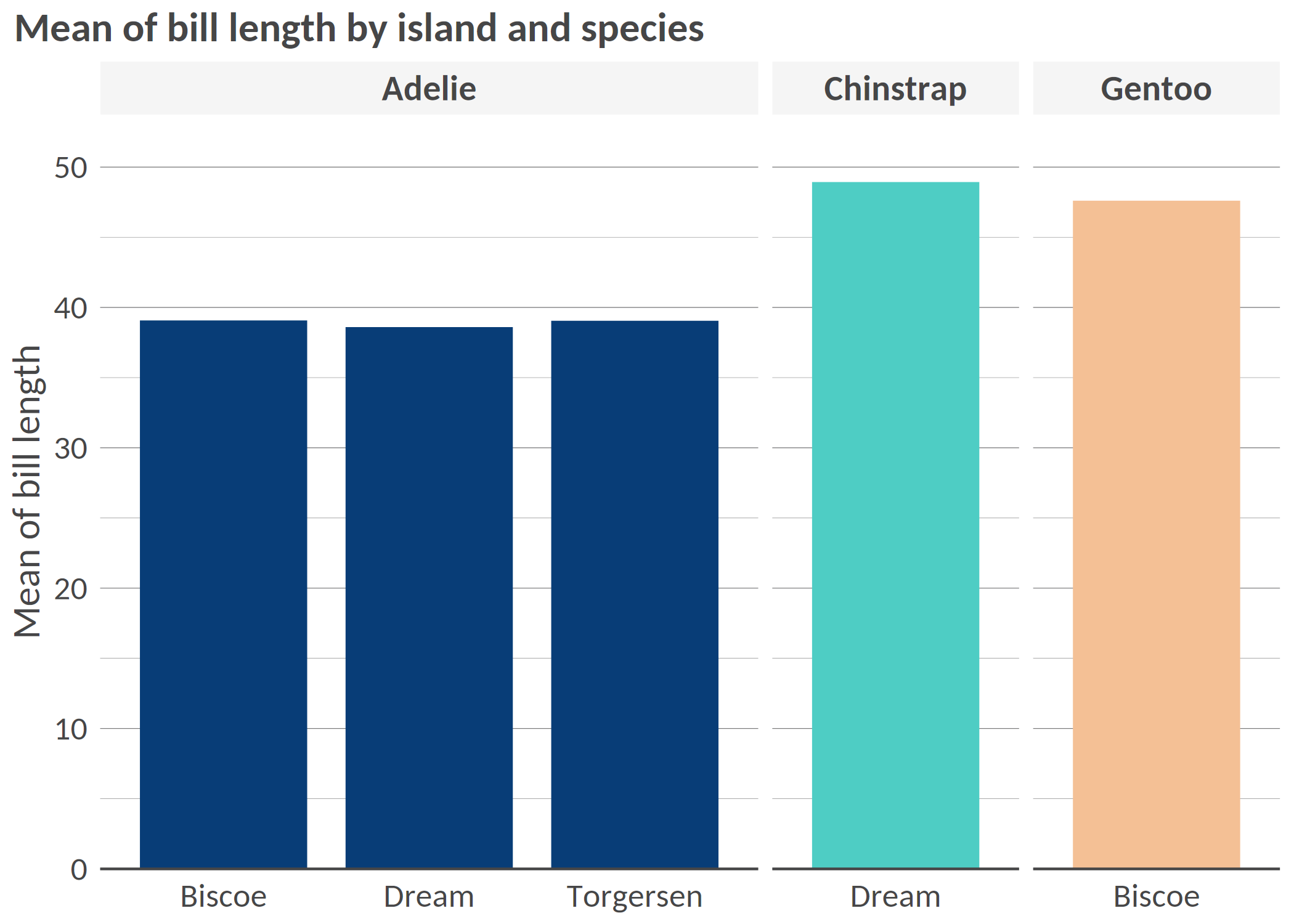
bar(df, 'island', 'mean_bl', facet = 'species', x_title = 'Mean of bill length', title = 'Mean of bill length by island and species', add_color_guide = FALSE)
# Flipped, with text, smaller width, and caption
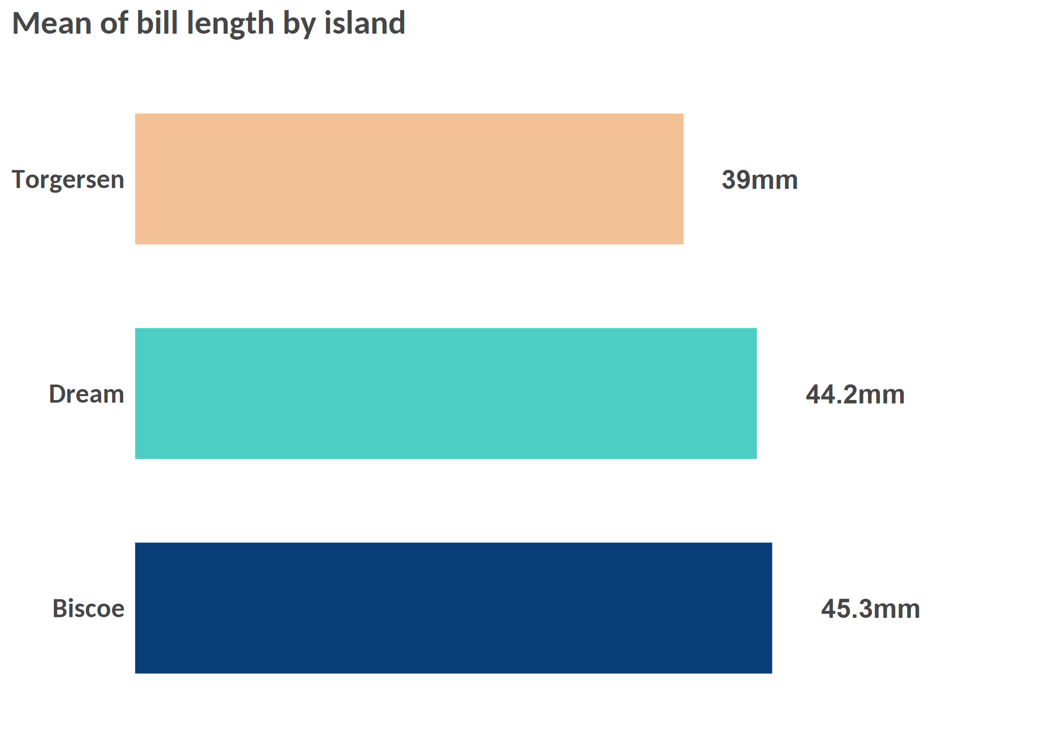
hbar(df = df_island, x = 'island', y = 'mean_bl', title = 'Mean of bill length by island', add_text = T, width = 0.6, add_text_suffix = 'mm', add_text_expand_limit = 1.3, add_color_guide = FALSE, caption = "Data: palmerpenguins package.")
Example 2: Scatterplot
# Simple scatterplot
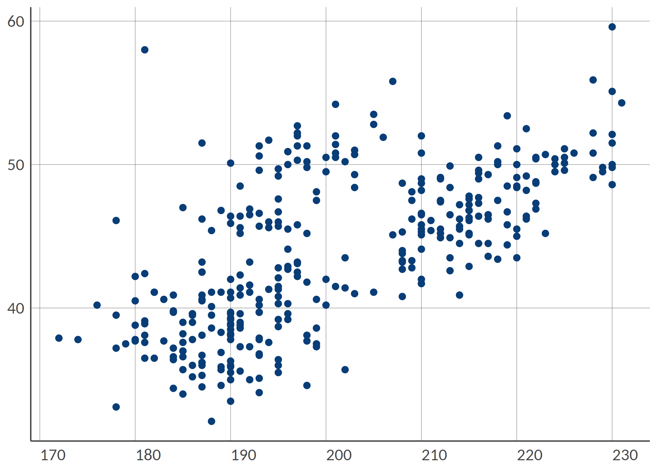
point(penguins, 'bill_length_mm', 'flipper_length_mm')
# Scatterplot with grouping colors, greater dot size, some transparency
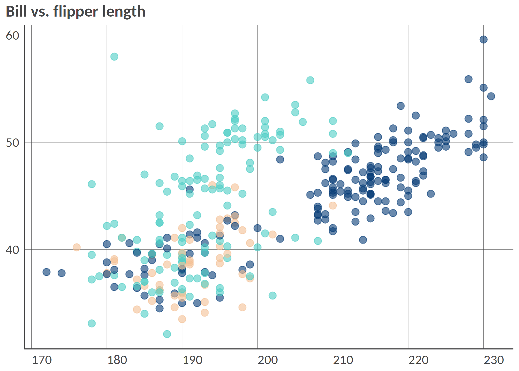
point(penguins, 'bill_length_mm', 'flipper_length_mm', 'island', group_title = 'Island', alpha = 0.6, size = 3, title = 'Bill vs. flipper length', , add_color_guide = FALSE)
# Facetted scatterplot by island
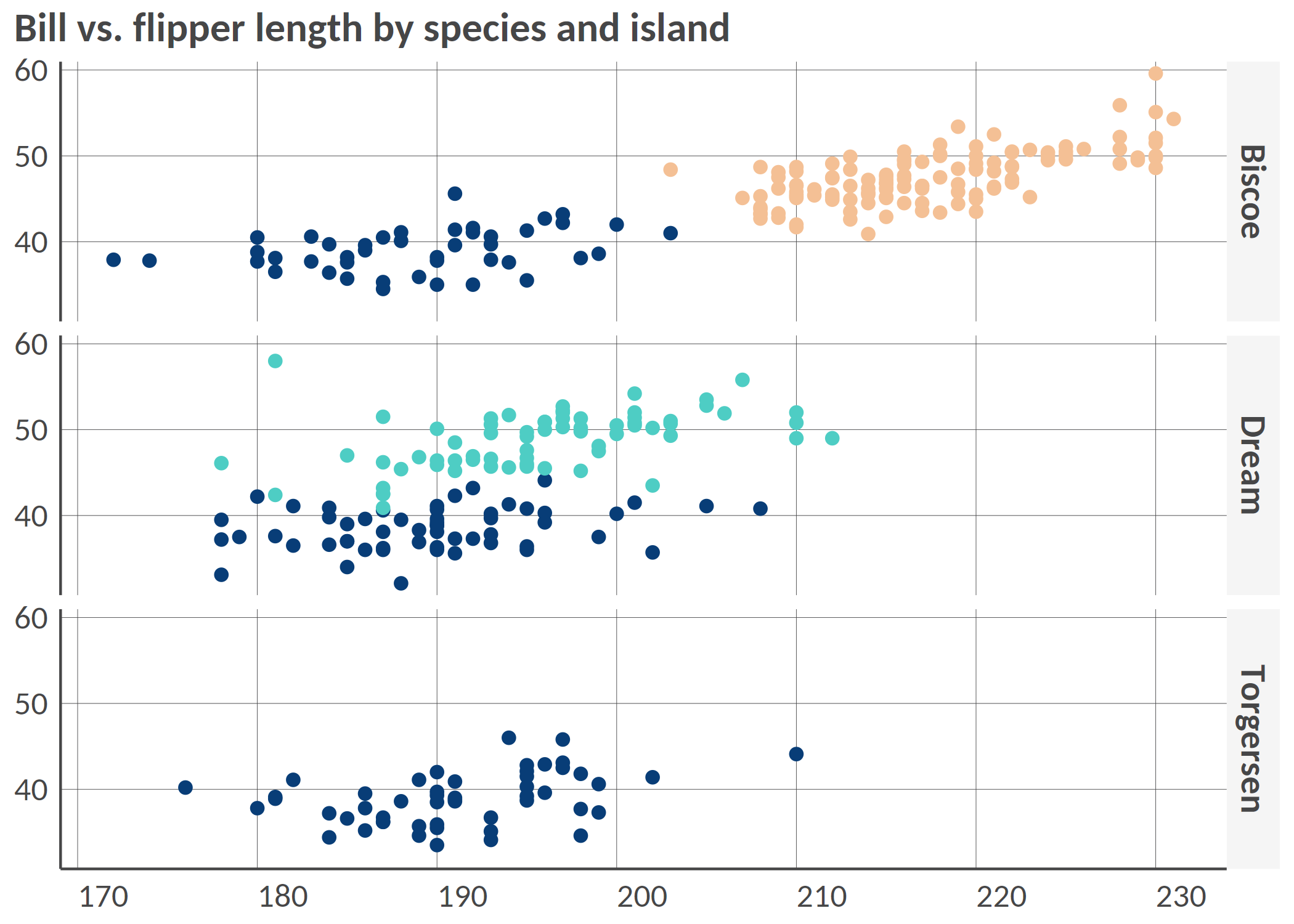
point(penguins, 'bill_length_mm', 'flipper_length_mm', 'species', 'island', 'fixed', group_title = 'Species', title = 'Bill vs. flipper length by species and island', add_color_guide = FALSE)
Example 3: Dumbbell plot
Remember to ensure that your data are in the long format and you only have two groups on the x-axis; for instance, IDP and returnee and no NA values.
# Prepare long data
df <- tibble::tibble(
  admin1 = rep(letters[1:8], 2),
  setting = c(rep(c('Rural', 'Urban'), 4), rep(c('Urban', 'Rural'), 4)),
  stat = rnorm(16, mean = 50, sd = 18)
) |>
  dplyr::mutate(stat = round(stat, 0))


# dumbbell(
#   df,
#   'stat',
#   'setting',
#   'admin1',
#   title = '% of HHs that reported open defecation as sanitation facility',
#   group_y_title = 'Admin 1',
#   group_x_title = 'Setting'
# )
Example 4: donut chart
# Some summarized data: % of HHs by displacement status
df <- tibble::tibble(
  status = c('Displaced', 'Non displaced', 'Returnee', 'Don\'t know/Prefer not to say'),
  percentage = c(18, 65, 12, 3)
)

# Donut
# donut(df,
#   status,
#   percentage,
#   hole_size = 3,
#   add_text_suffix = '%',
#   add_text_color = color('dark_grey'),
#   add_text_treshold_display = 5,
#   x_title = 'Displacement status',
#   title = '% of HHs by displacement status'
# )
Example 5: Waffle chart
#
# waffle(df, status, percentage, x_title = 'A caption', title = 'A title', subtitle = 'A subtitle')
Example 6: Alluvial chart
# Some summarized data: % of HHs by self-reported status of displacement in 2021 and in 2022
df <- tibble::tibble(
  status_from = c(
    rep('Displaced', 4),
    rep('Non displaced', 4),
    rep('Returnee', 4),
    rep('Dnk/Pnts', 4)
  ),
  status_to = c('Displaced', 'Non displaced', 'Returnee', 'Dnk/Pnts', 'Displaced', 'Non displaced', 'Returnee', 'Dnk/Pnts', 'Displaced', 'Non displaced', 'Returnee', 'Dnk/Pnts', 'Displaced', 'Non displaced', 'Returnee', 'Dnk/Pnts'),
  percentage = c(20, 8, 18, 1, 12, 21, 0, 2, 0, 3, 12, 1, 0, 0, 1, 1)
)

# Alluvial, here the group is the status for 2021

# alluvial(df,
#   status_from,
#   status_to,
#   percentage,
#   status_from,
#   from_levels = c("Displaced", "Non displaced", "Returnee", "Dnk/Pnts"),
#   alpha = 0.8,
#   group_title = "Status for 2021",
#   title = "% of HHs by self-reported status from 2021 to 2022"
# )
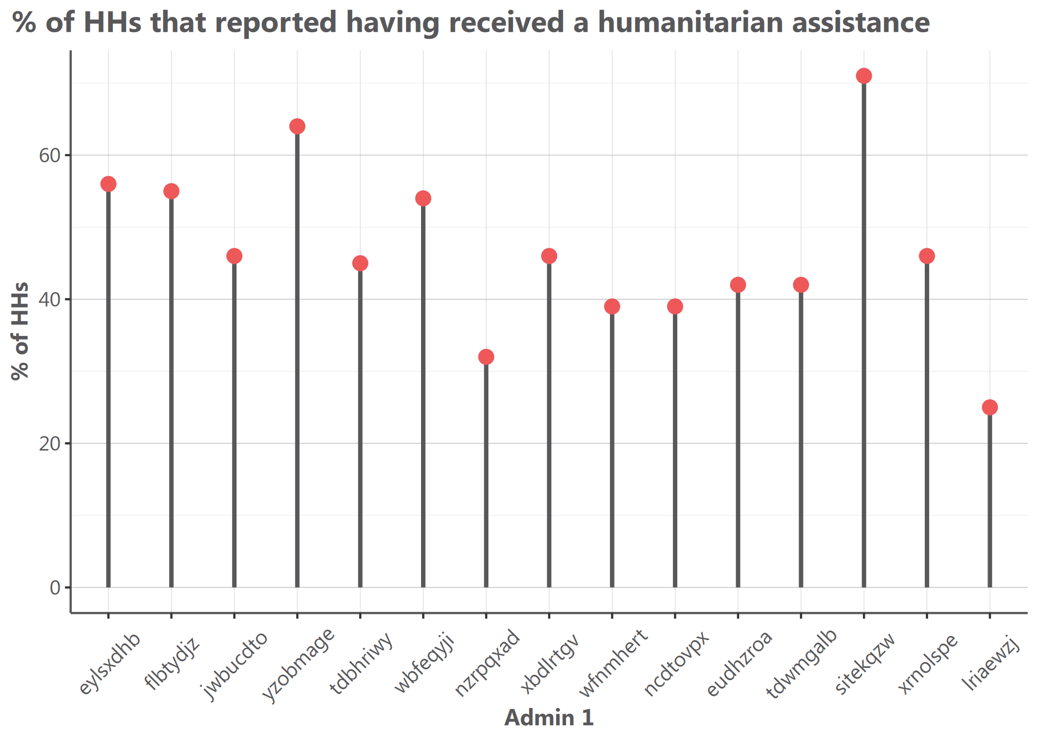
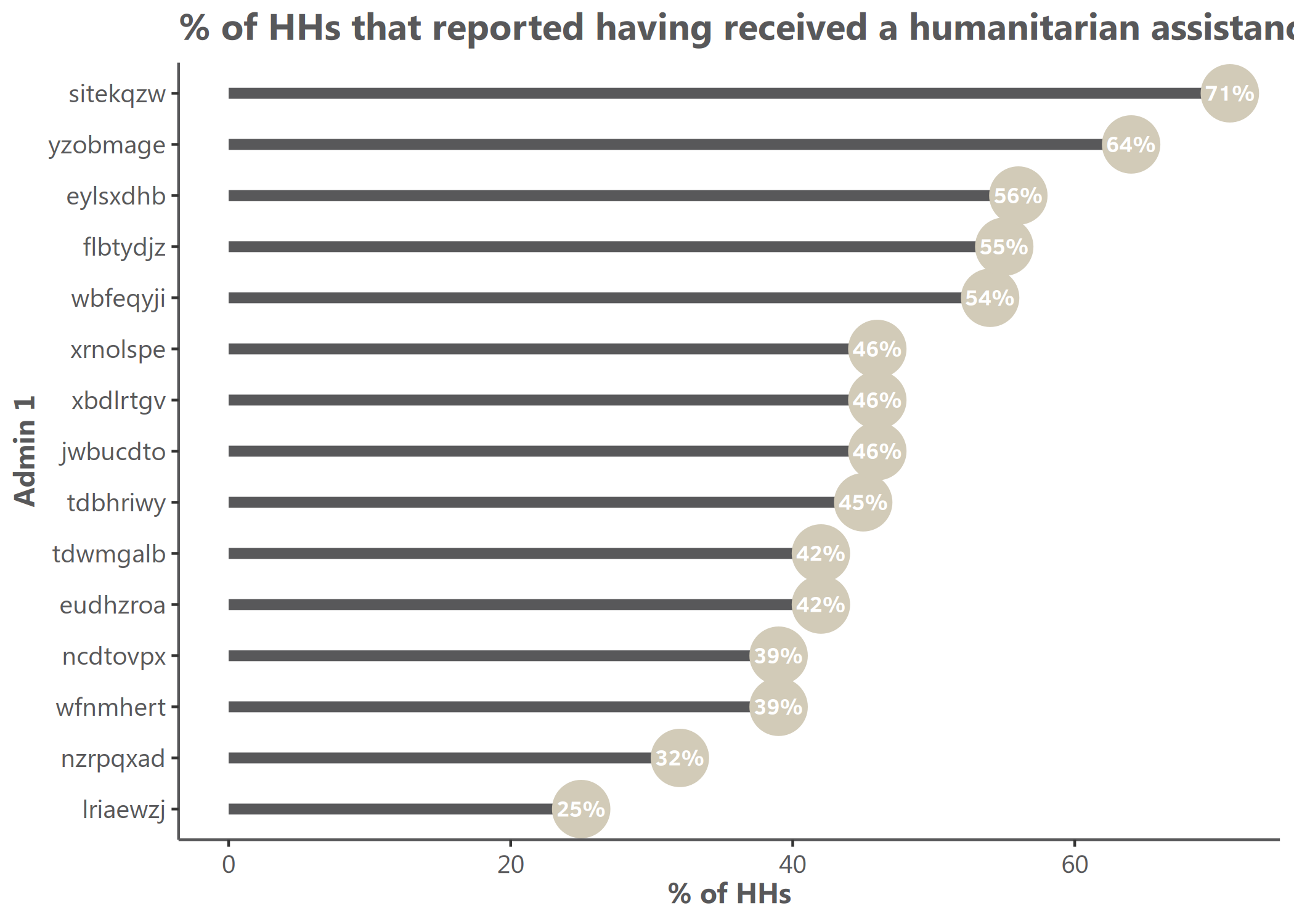
Example 7: Lollipop chart
library(tidyr)
# Prepare long data
df <- tibble::tibble(
  admin1 = replicate(15, sample(letters, 8)) |> t() |> as.data.frame() |> unite("admin1", sep = "") |> dplyr::pull(admin1),
  stat = rnorm(15, mean = 50, sd = 15)
) |>
  dplyr::mutate(stat = round(stat, 0))

# Simple vertical lollipop chart
lollipop(
  df = df,
  x = "admin1",
  y = "stat",
  flip = FALSE,
  dot_size = 3,
  y_title = "% of HHs",
  x_title = "Admin 1",
  title = "% of HHs that received humanitarian assistance"
)
# Horizontal lollipop chart with custom colors
hlollipop(
  df = df,
  x = "admin1",
  y = "stat",
  dot_size = 4,
  line_size = 1,
  add_color = color("cat_5_main_2"),
  line_color = color("cat_5_main_4"),
  y_title = "% of HHs",
  x_title = "Admin 1",
  title = "% of HHs that received humanitarian assistance"
)
# Create data for grouped lollipop - using set.seed for reproducibility
set.seed(123)
df_grouped <- tibble::tibble(
  admin1 = rep(c("A", "B", "C", "D", "E", "F"), 2),
  group = rep(c("Group A", "Group B"), each = 6),
  stat = c(rnorm(6, mean = 40, sd = 10), rnorm(6, mean = 60, sd = 10))
) |>
  dplyr::mutate(stat = round(stat, 0))

# Grouped lollipop chart with proper side-by-side positioning
lollipop(
  df = df_grouped,
  x = "admin1",
  y = "stat",
  group = "group",
  dodge_width = 0.8,  # Control spacing between grouped lollipops
  dot_size = 3.5,
  line_size = 0.8,
  y_title = "Value",
  x_title = "Category",
  title = "True side-by-side grouped lollipop chart"
)

# Horizontal grouped lollipop chart
hlollipop(
  df = df_grouped,
  x = "admin1",
  y = "stat",
  group = "group",
  dodge_width = 0.7,  # Narrower spacing for horizontal orientation
  dot_size = 3.5,
  line_size = 0.8,
  y_title = "Category",
  x_title = "Value",
  title = "Horizontal side-by-side grouped lollipop chart"
)

Lollipop Chart Features
Lollipop charts offer several advantages:
- Clean visualization of point data with connecting lines to a baseline
- True side-by-side grouped display for easy comparison between categories
- Each lollipop maintains its position from dot to baseline
- Customizable appearance with parameters for dot size, line width, and colors
- The
dodge_widthparameter controls spacing between grouped lollipops
The side-by-side positioning for grouped lollipops makes them visually distinct from dumbbell plots, which typically connect related points on the same line.