|
|
||
|---|---|---|
| data | ||
| data-raw | ||
| docs | ||
| man | ||
| pkgdown/favicon | ||
| R | ||
| .gitignore | ||
| .Rbuildignore | ||
| _pkgdown.yml | ||
| DESCRIPTION | ||
| LICENSE.md | ||
| NAMESPACE | ||
| NEWS.md | ||
| pkgdown.css | ||
| README.md | ||
| README.Rmd | ||
| visualizeR.Rproj | ||
visualizeR 
What a color! What a viz!
visualizeR proposes some utils to get REACH and AGORA colors,
ready-to-go color palettes, and a few visualization functions
(horizontal hist graph for instance).
Installation
You can install the last version of visualizeR from GitHub with:
# install.packages("devtools")
devtools::install_github("gnoblet/visualizeR", build_vignettes = TRUE)
Roadmap
Roadmap is as follows:
- Add IMPACT’s colors
- Add all color palettes from the internal documentation
- There remains to be added more-than-7-color palettes and black color palettes
- Add new types of visualization (e.g. dumbbell plot)
- Use examples
- Add some ease-map functions
- Add some interactive functions (maps and graphs)
Request
Please, do not hesitate to pull request any new viz or colors or color palettes, or to email request any change (guillaume.noblet@reach-initiative.org or gnoblet@zaclys.net).
Colors
Color palettes for REACH, AGORA and IMPACT are available. Functions to
access colors and palettes are cols_initiative() or
pal_initiative(). For now, the initiative with the most colors and
color palettes is REACH. Feel free to pull requests new AGORA and IMPACT
colors.
library(visualizeR)

# Get all saved REACH colors, named
cols_reach(unnamed = F)[1:10]
#>        white        black    main_grey     main_red main_lt_grey   main_beige
#>    "#FFFFFF"    "#000000"    "#58585A"    "#EE5859"    "#C7C8CA"    "#D2CBB8"
#>     iroise_1     iroise_2     iroise_3     iroise_4
#>    "#DFECEF"    "#B1D7E0"    "#699DA3"    "#236A7A"

# Extract a color palette as hexadecimal codes and reversed
pal_reach(palette = "main", reversed = TRUE, color_ramp_palette = FALSE)
#> [1] "#58585A" "#EE5859" "#C7C8CA" "#D2CBB8"

# Get all color palettes names
pal_reach(show_palettes = T)
#>  [1] "main"            "primary"         "secondary"       "two_dots"
#>  [5] "two_dots_flashy" "red_main"        "red_main_5"      "red_alt"
#>  [9] "red_alt_5"       "iroise"          "iroise_5"        "discrete_6"
#> [13] "red_2"           "red_3"           "red_4"           "red_5"
#> [17] "red_6"           "red_7"           "green_2"         "green_3"
#> [21] "green_4"         "green_5"         "green_6"         "green_7"
#> [25] "artichoke_2"     "artichoke_3"     "artichoke_4"     "artichoke_5"
#> [29] "artichoke_6"     "artichoke_7"     "blue_2"          "blue_3"
#> [33] "blue_4"          "blue_5"          "blue_6"          "blue_7"
Charts
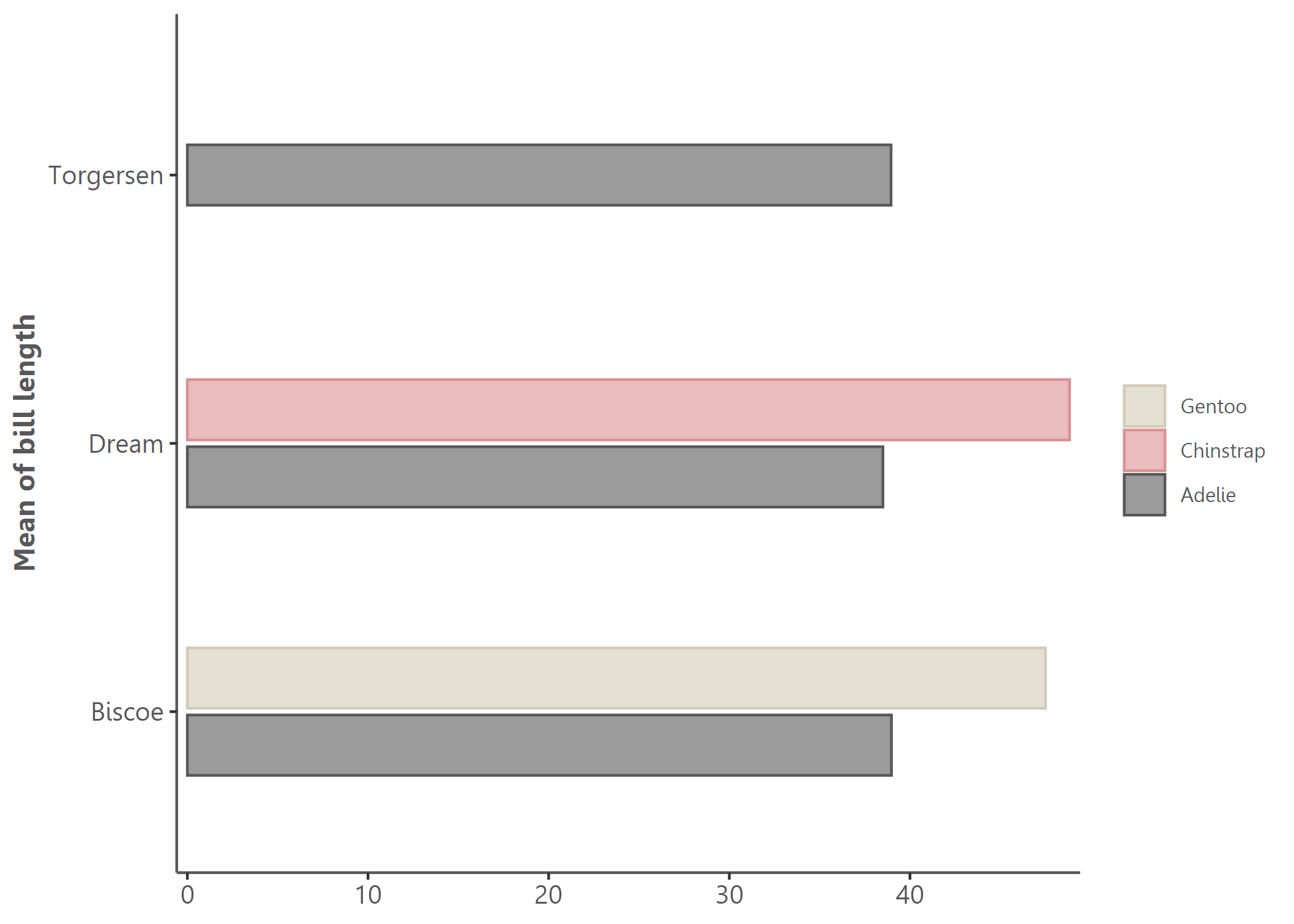
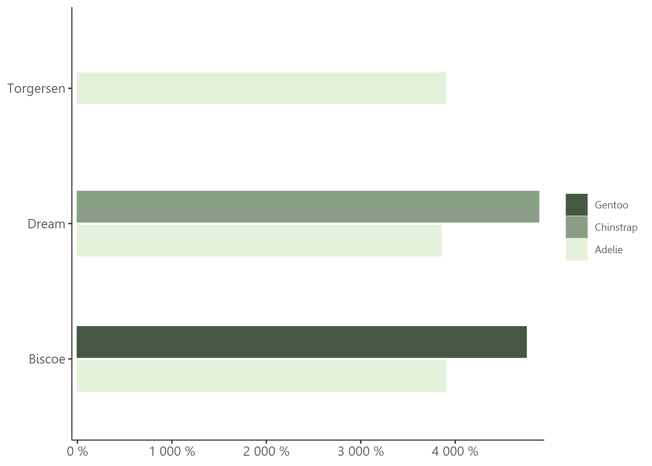
Example 1: Bar chart, already REACH themed
library(visualizeR)
library(palmerpenguins)
library(dplyr)
df <- penguins |>
group_by(island, species) |>
summarize(
mean_bl = mean(bill_length_mm, na.rm = T),
mean_fl = mean(flipper_length_mm, na.rm = T)) |>
ungroup()
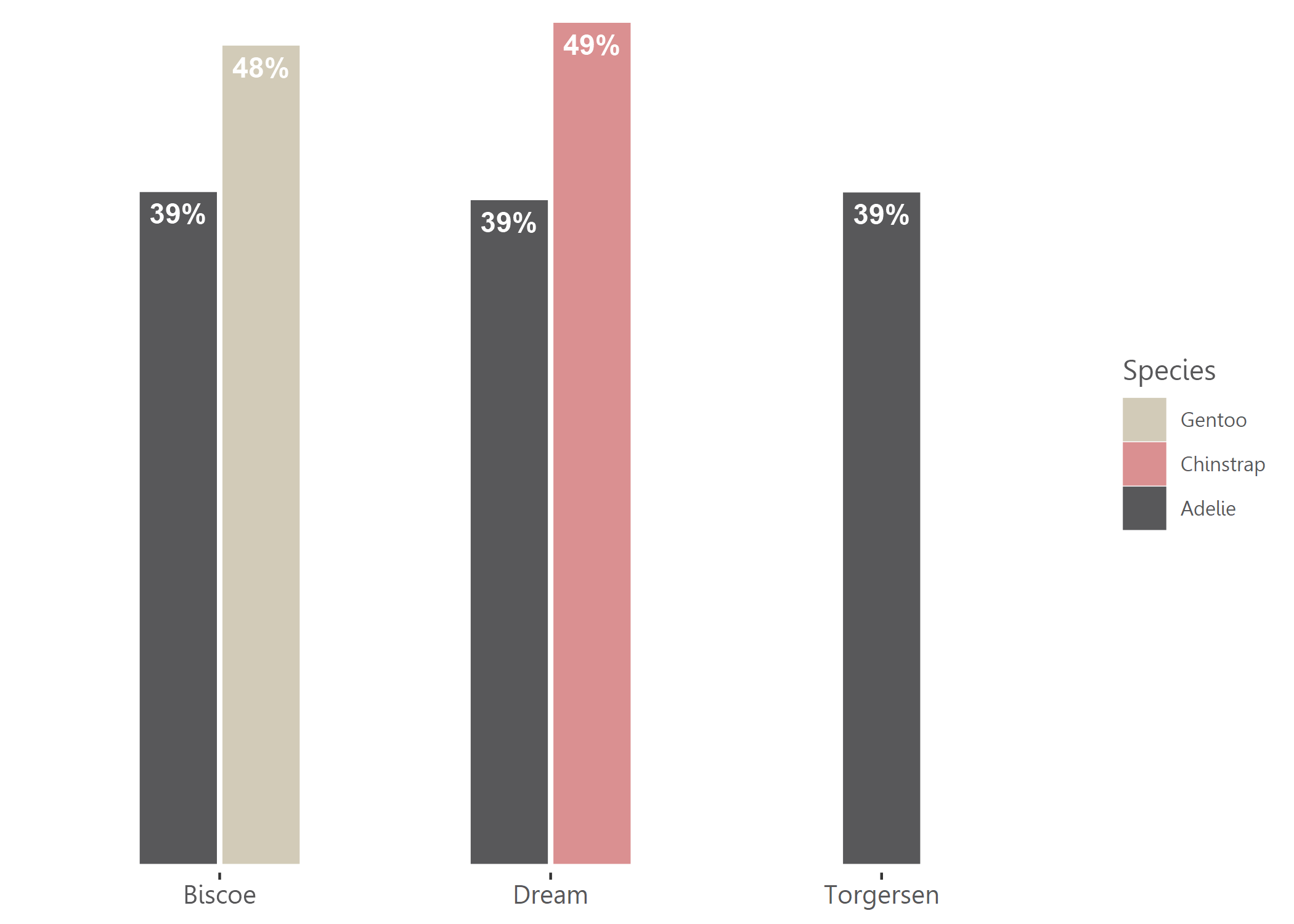
# Simple bar chart by group with some alpha transparency
bar(df, island, mean_bl, species, percent = FALSE, alpha = 0.6, x_title = "Mean of bill length")
# Using another color palette through `theme_reach()` and changing scale to percent
bar(df, island,mean_bl, species, percent = TRUE, theme = theme_reach(palette = "artichoke_3"))
# Not flipped, with text added, group_title, no y-axis and no bold for legend
bar(df, island, mean_bl, species, group_title = "Species", flip = FALSE, add_text = TRUE, add_text_suffix = "%", percent = FALSE, theme = theme_reach(text_font_face = "plain", axis_y = FALSE))
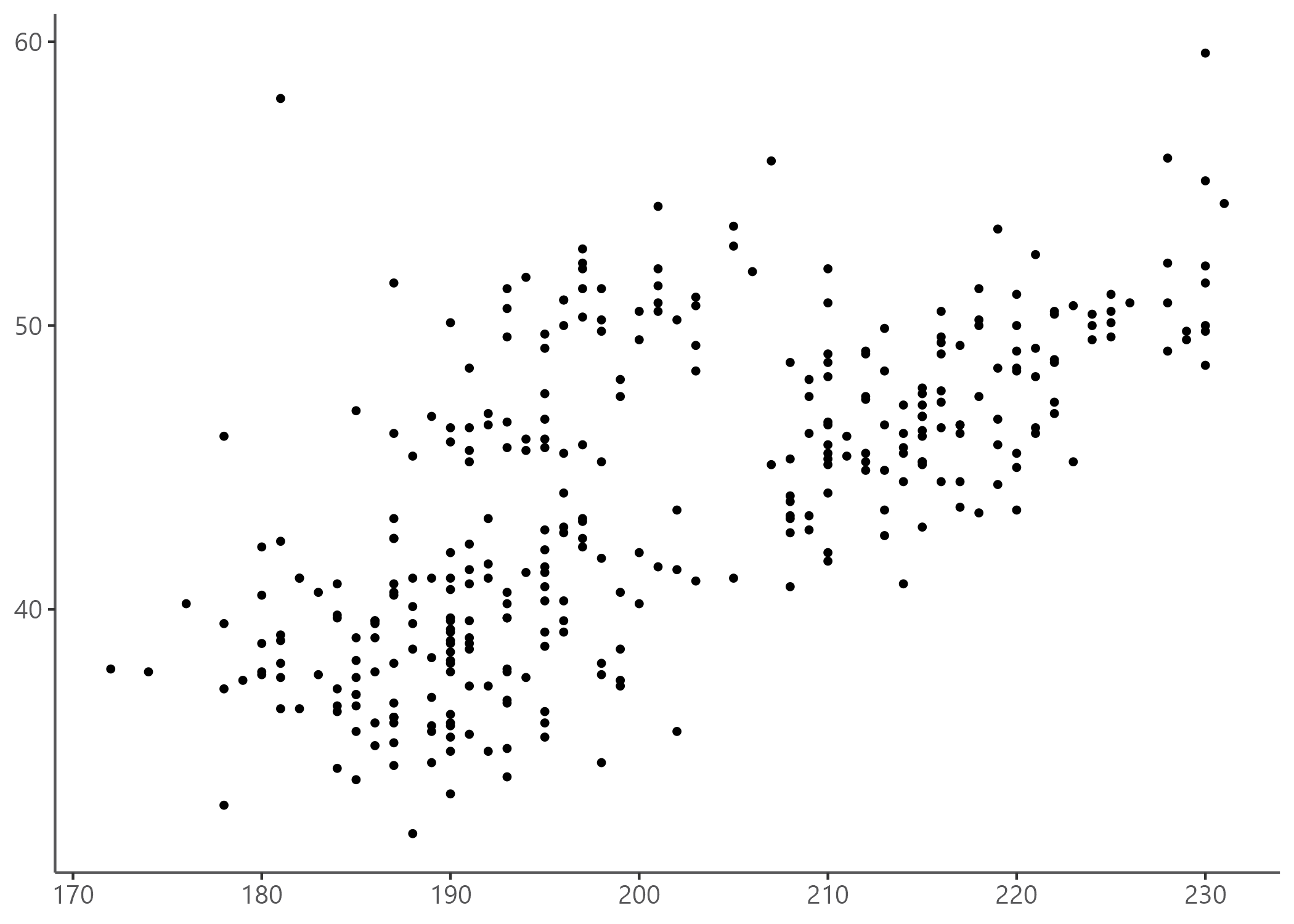
Example 2: Point chart, already REACH themed
At this stage, point_reach() only supports categorical grouping colors
with the group arg.
# Simple point chart
point(penguins, bill_length_mm, flipper_length_mm)
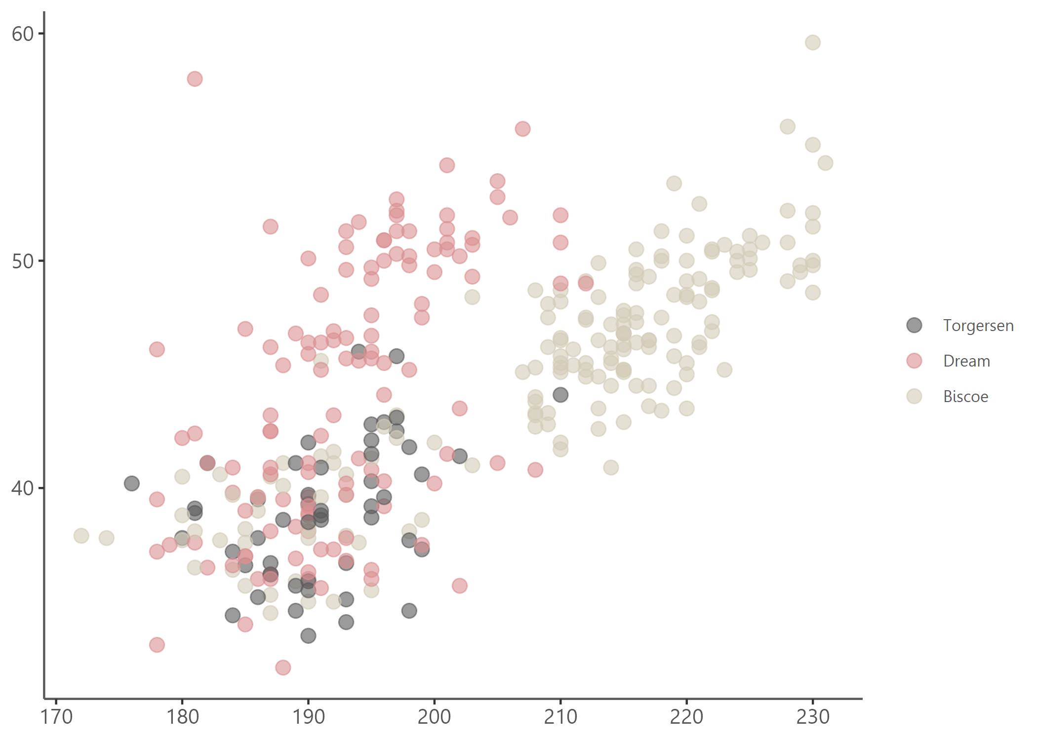
# Point chart with grouping colors, greater dot size, some transparency, reversed color palette
point(penguins, bill_length_mm, flipper_length_mm, island, alpha = 0.6, size = 3, theme = theme_reach(reverse = TRUE))
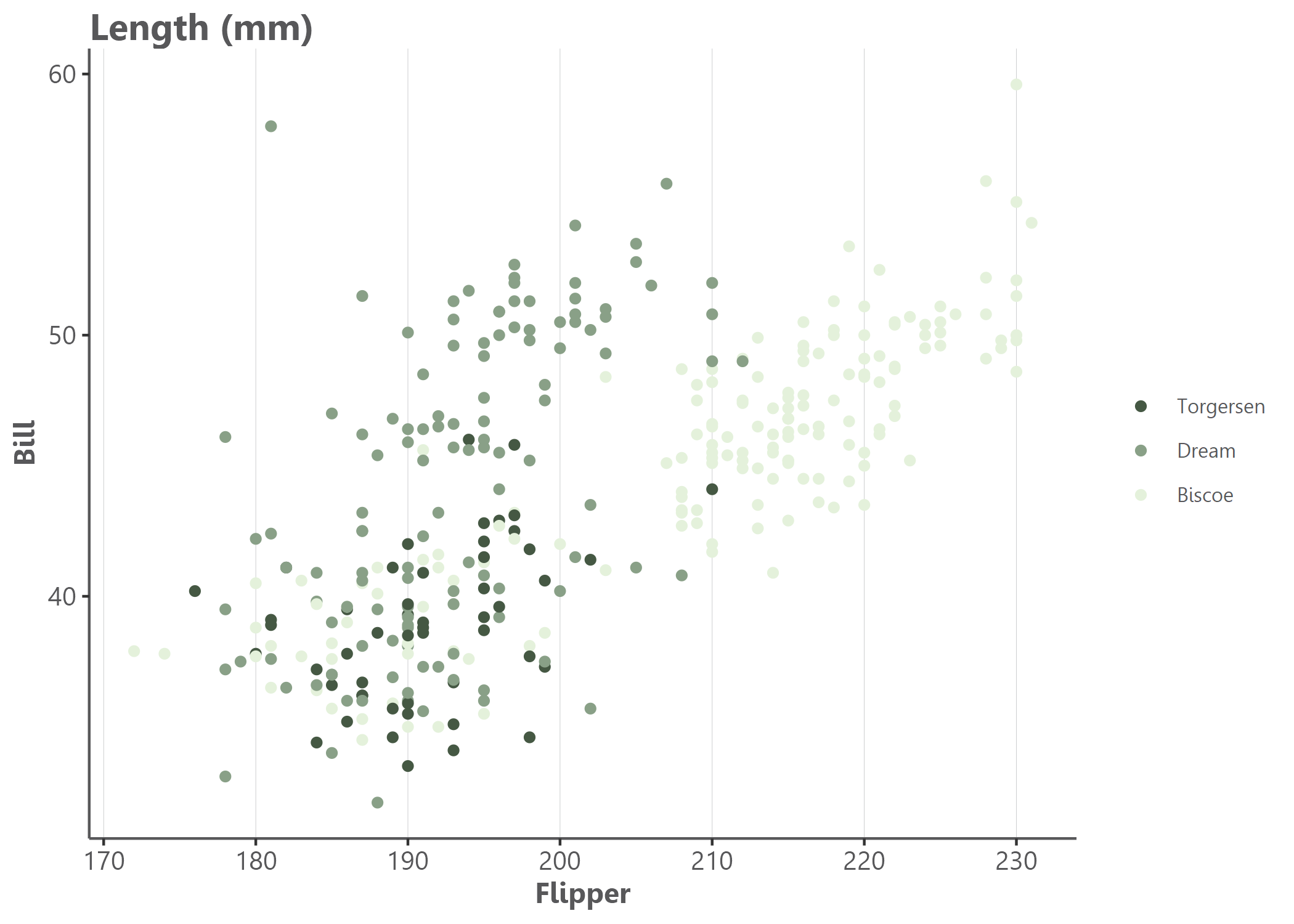
# Using another color palettes
point(penguins, bill_length_mm, flipper_length_mm, island, size = 1.5, x_title = "Bill", y_title = "Flipper", title = "Length (mm)", theme = theme_reach(palette = "artichoke_3", text_font_face = , grid_x = T,  title_position_to_plot = FALSE))
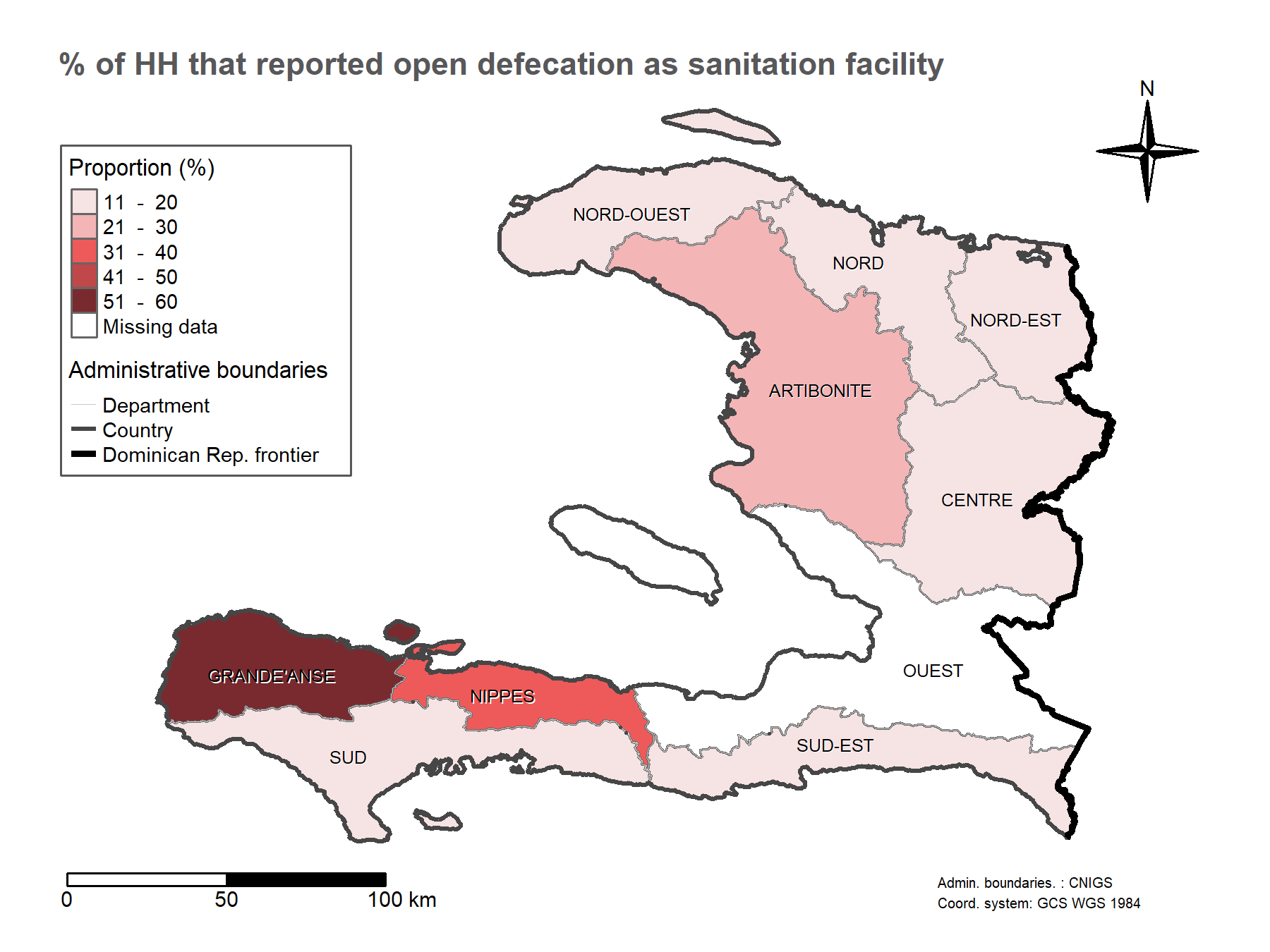
Maps
# Add indicator layer
# - based on "pretty" classes and title "Proportion (%)"
# - buffer to add a 10% around the bounding box
map <- add_indicator_layer(
  indicator_admin1,
  opn_dfc,
  buffer = 0.1) +
  # Layout - some defaults - add the map title
  add_layout("% of HH that reported open defecation as sanitation facility") +
  # Admin boundaries as list of shape files (lines) and colors, line widths and labels as vectors
  add_admin_boundaries(
    lines = list(line_admin1, border_admin0, frontier_admin0),
    colors = cols_reach("main_lt_grey", "dk_grey", "black"),
    lwds = c(0.5, 2, 3),
    labels = c("Department", "Country", "Dominican Rep. frontier"),
    title = "Administrative boundaries") +
  # Add text labels - centered on admin 1 centroids
  add_admin_labels(centroid_admin1, ADM1_FR_UPPER) +
  # Add a compass
  add_compass() +
  # Add a scale bar
  add_scale_bar() +
  # Add credits
  add_credits("Admin. boundaries. : CNIGS \nCoord. system: GCS WGS 1984")